import numpy as np
import matplotlib.pyplot as plt
import pandas as pd
import seaborn as sns
from sklearn.datasets import make_friedman1
from sklearn.model_selection import train_test_split
from sklearn.linear_model import QuantileRegressor
from sklearn.ensemble import HistGradientBoostingRegressor
from sklearn.metrics import mean_pinball_lossQuantile Regression
Regression Without The Mean
Squared Error versus Absolute Error
For regression, the most common loss function is the mean squared error (MSE). That is, models are often constructed to minimize the (mean) squared error.1 However, MSE is not the only acceptable loss function. The mean absolute error (MAE) is the most common alterative.2 Previously, we have used mean absolute error to evaluate models that had already been constructed. Now, we will consider the mean absolute error as a loss function to be minimized during training.
Mean Squared Error
\[ L(y, \hat{y}) = \frac{1}{n} \sum_{i=1}^{n} (y_i - \hat{y}_i)^2 \]
Mean Absolute Error
\[ L(y, \hat{y}) = \frac{1}{n} \sum_{i=1}^{n} |y_i - \hat{y}_i| \]
Show Code for Plot
# values for plotting
errors = np.linspace(-3, 3, 400)

# create plot
fig, ax = plt.subplots(figsize=(10, 6))
ax.plot(errors, errors**2, label="Squared Error", color="tab:blue")
ax.plot(errors, np.abs(errors), label="Absolute Error", color="tab:orange")
ax.set_xlabel("Prediction Error: $y_i - \\hat{y}_i$")
ax.set_ylabel("Loss Contribution")
ax.set_title("Squared vs Absolute Error Contributions")
ax.legend()
# show plot
plt.show()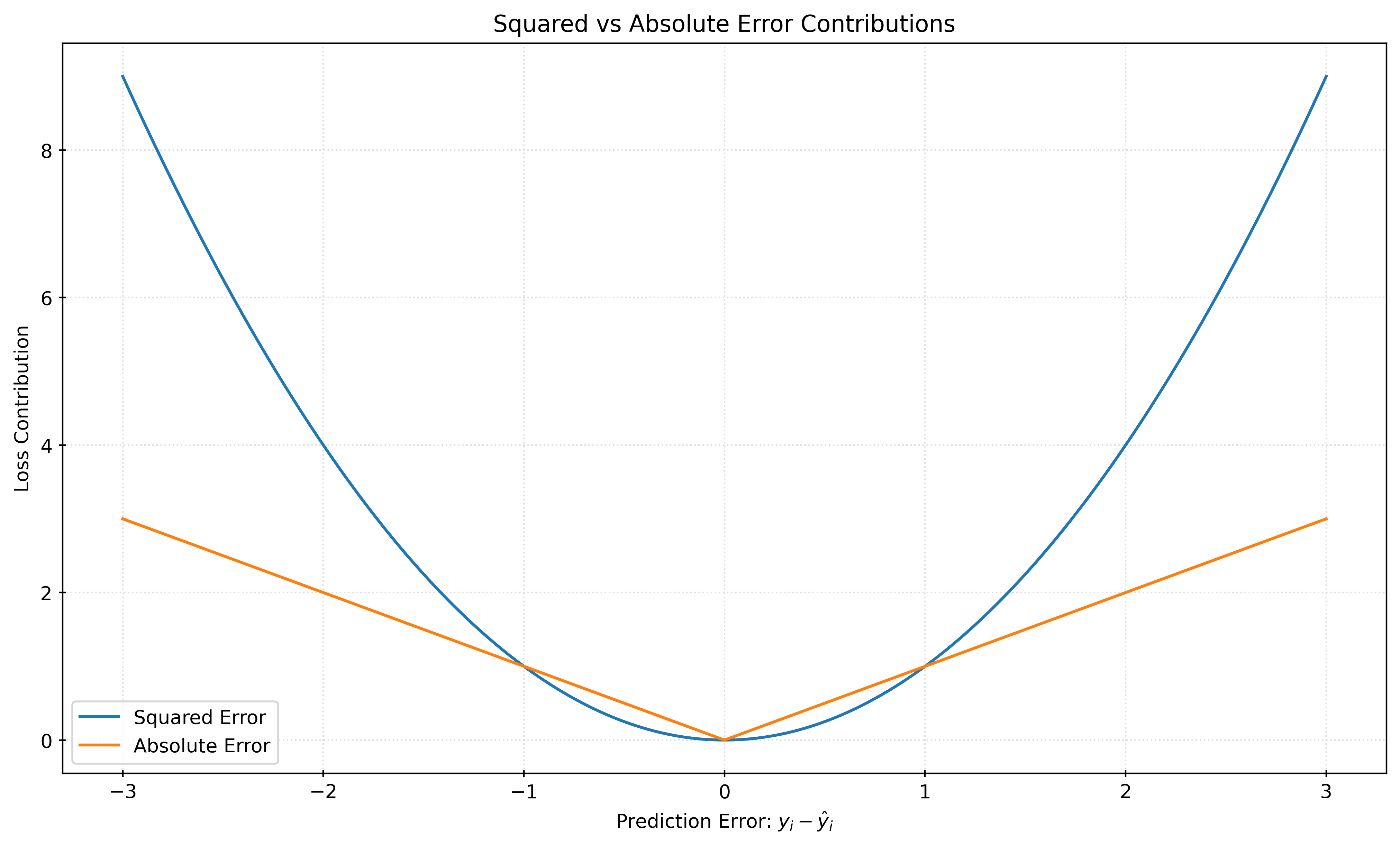
Figure 1 shows the loss contributions for the squared error and absolute error as a function of a potential prediction error, \(y_i - \hat{y}_i\). When the magnitude of th error is less than \(1\), the resulting squared error is smaller than the absolute error. However, the squared error grows much faster than the absolute error for larger errors. This is why squared error is often said to “defend” against large errors.
When the squared error is minimized, the resulting model estimates the conditional mean of the target variable. When the absolute error is minimized, the resulting model estimates the conditional median of the target variable.
When the target variables is symmetric (conditional on the features), the conditional mean and median are the same. With an asymmetric target variable, the conditional mean and median will be different.
Quantiles
The median is the 50th percentile, which divides a distribution (or data) into two equal halves. The median is also a particular case of a quantile, specifically the 0.5 quantile. Quantiles are defined as the values that divide a probability distribution into intervals containing specified probabilities.
For a random variable \(X\), the \(p\) quantile, \(Q(p)\), is the value \(q\) such that:
\[ F(q) = P(X \leq q) = p, \]
where \(F(x)\) is the cumulative distribution function (CDF) of the random variable \(X\).
The quantile function is the inverse of the cumulative distribution function (CDF).
\[ q = Q(p) = F^{-1}(p) = \inf \{ x : F(x) \geq p \} \]
The quantile function is also known as the percent-point function. In scipy, the quantile function is implemented as scipy.stats.<distribution>.ppf. For example, the quantile function for the normal distribution is scipy.stats.norm.ppf.
from scipy.stats import normX = norm(loc=0, scale=1)
quantiles = [0.025, 0.5, 0.975]
for q in quantiles:
print(f"Quantile {q}: {X.ppf(q):.2f}")Quantile 0.025: -1.96
Quantile 0.5: 0.00
Quantile 0.975: 1.96p = X.cdf(2)
q = X.ppf(p)
print(f"The {p:.4f} quantile of the standard normal distribution is {q:.4f}.")The 0.9772 quantile of the standard normal distribution is 2.0000.When dealing with sample data, rather than a probability distribution, the quantiles must be estimated. With a sample of \(n\) observations, we would like the \(p\) (sample) quantile to be the value \(q\) such that:
\[ \frac{1}{n} \sum_{i=1}^{n} I(X_i \leq q) = p, \]
where \(I(X_i \leq q)\) is an indicator function that is equal to 1 if \(X_i \leq q\) and 0 otherwise. However, there may be multiple values of \(q\) that satisfy this equation, or there may be no such value. As such, different software packages use different methods with specific details for estimating quantiles, usually involving ranks, but we will exclude those details here.
import numpy as npnp.random.seed(42)
data = np.random.normal(size=100)
quantiles = [0.025, 0.5, 0.975]
for q in quantiles:
print(f"(Sample) Quantile {q}: {np.quantile(data, q):.2f}")(Sample) Quantile 0.025: -1.94
(Sample) Quantile 0.5: -0.13
(Sample) Quantile 0.975: 1.55np.mean(data < np.quantile(data, 0.025))0.03Pinball Loss
Understanding that the median is a specific quantile, and minimizing mean absolute error constructs a model that estimates the conditional median, \(Q(0.5)\), we are left to wonder if it is possible to construct models that estimate other (conditional) quantiles.
Instead of minimizing the mean absolute error, we can minimize the mean pinball loss.
Pinball Loss
\[ L_\tau(y, \hat{y}) = \frac{1}{n} \sum_{i=1}^{n} \left( \tau \cdot \max(y_i - \hat{y}_i, 0) + (1 - \tau) \cdot \max(\hat{y}_i - y_i, 0) \right) \]
Show Code for Plot
# define pinball loss
def pinball_loss(errors, quantile):
    loss = np.where(
        errors >= 0,
        quantile * np.abs(errors),
        (1 - quantile) * np.abs(errors),
    )
    return loss


# values for plotting
errors = np.linspace(-3, 3, 400)

# quantiles and their styles for plotting
quantiles = [0.1, 0.5, 0.9]
line_styles = ["-", "--", "-."]

# create plot
fig, ax = plt.subplots(figsize=(10, 6))
for q, ls in zip(quantiles, line_styles):
    losses = pinball_loss(errors, q)
    ax.plot(errors, losses, linestyle=ls, label=f"Quantile: {q}")
ax.set_xlabel("Prediction Error: $y_i - \\hat{y}_i$")
ax.set_ylabel("Pinball Loss Contribution")
ax.set_title("Pinball Loss Contributions for Various Quantiles")
ax.legend()

# show plot
plt.show()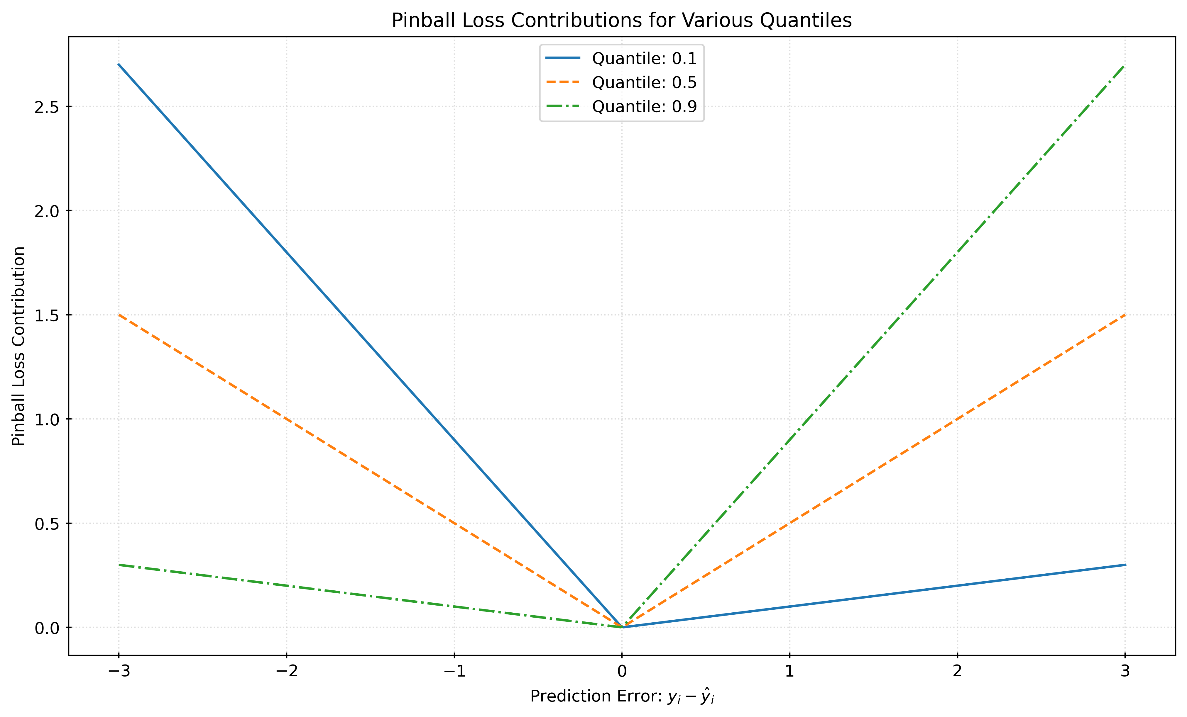
With \(\alpha = 0.5\), minimizing the pinball loss is equivalent to minimizing the mean absolute error, and thus creates a model that estimates the conditional median, \(Q(0.5)\). Minimizing pinball loss with an \(\alpha\) other than \(0.5\) gives a model that estimates the conditional quantile \(\alpha\), \(Q(\alpha)\).
For example, with \(\alpha = 0.1\), minimizing the pinball loss gives a model that estimates the conditional 10th percentile, \(Q(0.1)\).
(Linear) Quantile Regression
Using pinball loss, we can construct a model that estimate a particular conditional quantile. This process is known as quantile regression. The QuantileRegressor class in sklearn.linear_model implements quantile regression for linear models.
QuantileRegressor|sklearnAPI Reference- Quantile Regression |
sklearnExamples - Quantile Regression |
sklearnUser Guide
Specifically, the QuantileRegressor class fits the following linear model:
\[ Q_\tau(x) = \beta_0 + \beta_1 x_1 + \beta_2 x_2 + \ldots + \beta_p x_p \]
Here, \(Q_\tau(x)\) is the quantile regression function which gives the \(\tau\) quantile of the target variable \(Y\) given the features \(x_1, x_2, \ldots, x_p\).3
After fitting a quantile regression model, we can predict (estimate) the \(\tau\) quantile of the target variable given new feature data \(x\).
\[ \hat{Q}_\tau(x) = \hat{\beta}_0 + \hat{\beta}_1 x_1 + \hat{\beta}_2 x_2 + \ldots + \hat{\beta}_p x_p \]
# generate some data
X, y = make_friedman1(
    n_samples=200,
    noise=0.2,
    random_state=42,
)

# train-test split the data
X_train, X_test, y_train, y_test = train_test_split(
    X,
    y,
    test_size=0.5,
    random_state=42,
)
# make and fit quantile regression for the 0.5 quantile (median)
qr = QuantileRegressor(quantile=0.5, alpha=0)
qr.fit(X_train, y_train)
# predict the conditional median for (some) test data
qr.predict(X_test[:5])array([19.85808411, 19.59420099, 13.45976634, 16.11320326, 9.00020865])Note that by default, QuantileRegressor applies a regularization penalty to the model, which is controlled by the alpha parameter. Here, we have set alpha=0 to remove the regularization. In practice, it may be appropriate to consider regularization.
Prediction Intervals
Suppose we would like to create a \((1-\alpha) \cdot 100 \%\) prediction interval for a new observation \(x\). Using two quantile regression models, we can estimate the lower and upper bounds of the prediction interval. The lower bound is the \(\alpha/2\) quantile, and the upper bound is the \(1 - \alpha/2\) quantile.
\[ \left( \hat{Q}_{\alpha/2}(x), \hat{Q}_{1 - \alpha/2}(x) \right) \]
For example, to create a 90% prediction interval, we would use \(\alpha = 0.1\). This interval would use the 5th percentile, \(Q(0.05)\) as the lower bound, and the 95th percentile, \(Q(0.95)\) as the upper bound.
# create and fit model for lower bound
qr_lower = QuantileRegressor(quantile=0.05, alpha=0)
qr_lower.fit(X_train, y_train)

# create and fit model for lower bound
qr_upper = QuantileRegressor(quantile=0.95, alpha=0)
qr_upper.fit(X_train, y_train)

# predict with both models to "create" intervals for (some) test data
intervals = pd.DataFrame(
    {
        "lower": qr_lower.predict(X_test[:5]),
        "upper": qr_upper.predict(X_test[:5]),
    }
)

# view the intervals
intervals| lower | upper | |
|---|---|---|
| 0 | 18.10 | 23.84 |
| 1 | 14.64 | 23.70 |
| 2 | 9.56 | 15.79 |
| 3 | 10.61 | 19.07 |
| 4 | 4.27 | 11.57 |
To verify that our models are creating the correct prediction intervals, we can check the coverage of the intervals. The coverage is the proportion of true \(y\) values that fall within the calculated prediction intervals. The coverage for a \((1-\alpha) \cdot 100 \%\) interval should be approximately \((1-\alpha) \cdot 100 \%\).
def coverage(y_true, lower, upper):
    return np.mean((y_true >= lower) & (y_true <= upper))
# get intervals for train data, calculate coverage
train_lower = qr_lower.predict(X_train)
train_upper = qr_upper.predict(X_train)
train_coverage = coverage(y_train, train_lower, train_upper)
# get intervals for test data, calculate coverage
test_lower = qr_lower.predict(X_test)
test_upper = qr_upper.predict(X_test)
test_coverage = coverage(y_test, test_lower, test_upper)
print(f"Train Coverage: {train_coverage:.3f}")
print(f"Test Coverage: {test_coverage:.3f}")Train Coverage: 0.900
Test Coverage: 0.800Notice that the coverage in the train data is approximately correct, given that we created models for 90% prediction intervals. However, the test coverage is a bit low.
# calculate average interval length for train and test sets
train_interval_length = np.mean(train_upper - train_lower)
test_interval_length = np.mean(test_upper - test_lower)
print(f"Average Train Interval Length: {train_interval_length:.3f}")
print(f"Average Test Interval Length: {test_interval_length:.3f}")Average Train Interval Length: 7.369
Average Test Interval Length: 6.962Quantile Regression with Gradient Boosting
HistGradientBoostingRegressor|sklearnAPI Reference- Prediction Intervals for Gradient Boosting Regression | ‘sklearn’ Examples
# create and fit model for lower bound
qr_lower = HistGradientBoostingRegressor(
loss="quantile",
quantile=0.05,
random_state=42,
)
qr_lower.fit(X_train, y_train)
# create and fit model for lower bound
qr_upper = HistGradientBoostingRegressor(
loss="quantile",
quantile=0.95,
random_state=42,
)
qr_upper.fit(X_train, y_train)
# predict with both models to "create" intervals for (some) test data
intervals = pd.DataFrame(
{
"lower": qr_lower.predict(X_test[:5]),
"upper": qr_upper.predict(X_test[:5]),
}
)
# view the intervals
intervals| lower | upper | |
|---|---|---|
| 0 | 15.71 | 22.65 |
| 1 | 12.31 | 21.50 |
| 2 | 11.67 | 13.89 |
| 3 | 12.55 | 15.92 |
| 4 | 9.32 | 18.33 |
# get intervals for train data, calculate coverage
train_lower = qr_lower.predict(X_train)
train_upper = qr_upper.predict(X_train)
train_coverage = coverage(y_train, train_lower, train_upper)

# get intervals for test data, calculate coverage
test_lower = qr_lower.predict(X_test)
test_upper = qr_upper.predict(X_test)
test_coverage = coverage(y_test, test_lower, test_upper)

print(f"Train Coverage: {train_coverage:.3f}")
print(f"Test Coverage: {test_coverage:.3f}")
Train Coverage: 0.850
Test Coverage: 0.770# calculate average interval length for train and test sets
train_interval_length = np.mean(train_upper - train_lower)
test_interval_length = np.mean(test_upper - test_lower)
print(f"Average Train Interval Length: {train_interval_length:.3f}")
print(f"Average Test Interval Length: {test_interval_length:.3f}")Average Train Interval Length: 7.943
Average Test Interval Length: 7.388Illustrative Examples
Heteroscedastic Data
def generate_heteroscedastic_data(n_samples, seed=42):
    rng = np.random.RandomState(seed)
    x = np.linspace(start=0, stop=10, num=n_samples)
    X = x[:, np.newaxis]
    y_mean = 10 + 0.5 * x
    y = y_mean + rng.normal(
        loc=0,
        scale=0.5 + 0.5 * x,
        size=n_samples,
    )
    return X, y
X, y = generate_heteroscedastic_data(n_samples=200)X_train, X_test, y_train, y_test = train_test_split(
X,
y,
test_size=0.5,
random_state=42,
)Show Code for Plot
quantiles = [0.05, 0.5, 0.95]
predictions = {}
pred_outside = np.zeros_like(y_test, dtype=np.bool_)

for quantile in quantiles:
    qr = QuantileRegressor(quantile=quantile, alpha=0)
    qr.fit(X_train, y_train)
    y_pred = qr.predict(X_test)
    predictions[quantile] = y_pred
    if quantile == min(quantiles):
        pred_outside = np.logical_or(pred_outside, y_pred >= y_test)
    if quantile == max(quantiles):
        pred_outside = np.logical_or(pred_outside, y_pred <= y_test)

fig, ax = plt.subplots(figsize=(10, 6))
x = np.linspace(start=0, stop=10, num=1000)
ax.plot(
    x,
    10 + 0.5 * x,
    color="black",
    linestyle="--",
    label="True Mean",
)
for quantile, y_pred in predictions.items():
    ax.plot(X_test, y_pred, label=f"Quantile: {quantile}")
ax.scatter(
    X_test[pred_outside],
    y_test[pred_outside],
    color="black",
    marker="+",
    alpha=0.5,
    label="Outside Interval",
)
ax.scatter(
    X_test[~pred_outside],
    y_test[~pred_outside],
    color="black",
    alpha=0.5,
    label="Inside Interval",
)
ax.legend()
ax.set_xlabel("x")
ax.set_ylabel("y")
ax.set_title("Quantiles: Heteroscedastic Normal Target")
plt.show()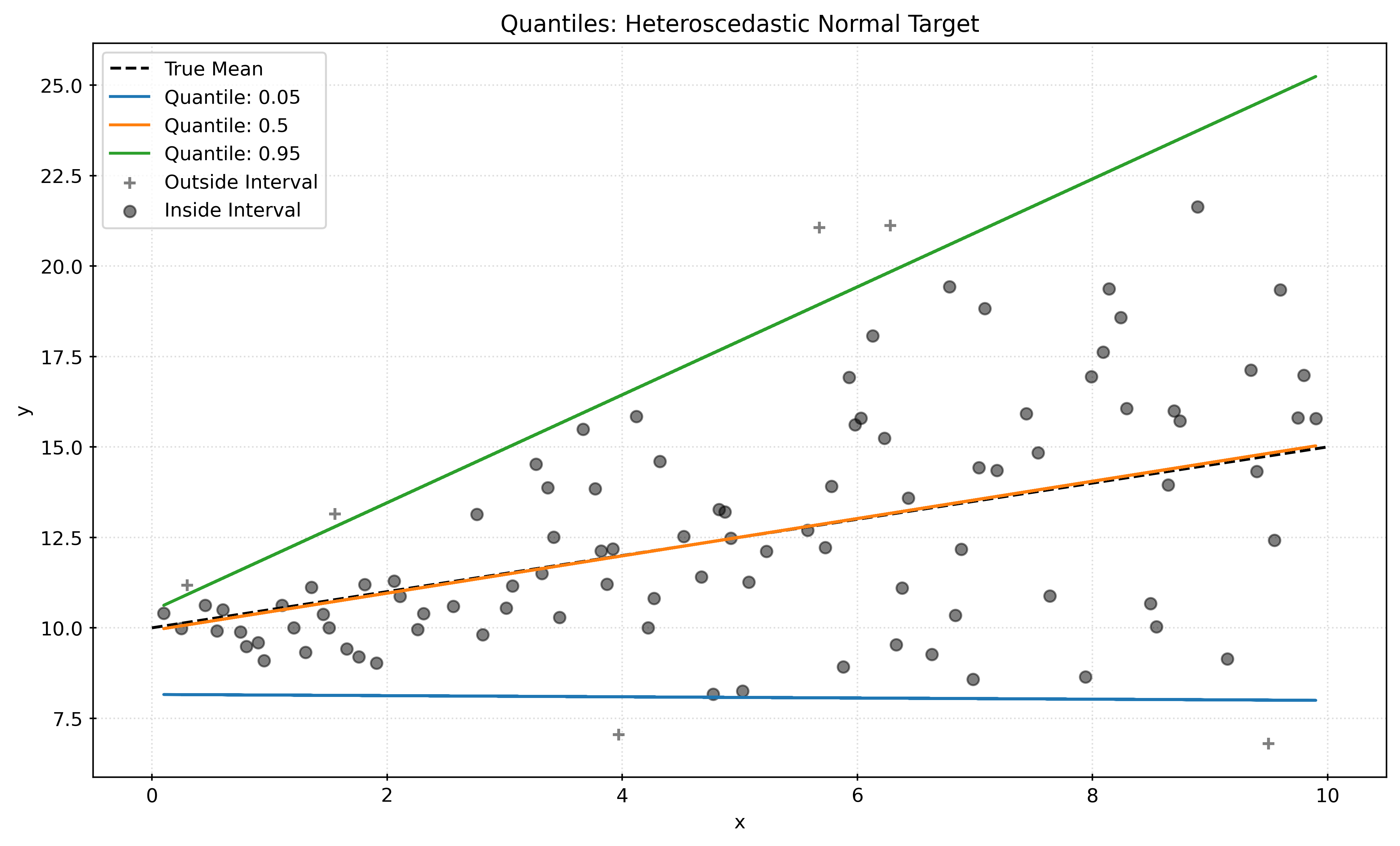
Asymmetric Data
def generate_asymmetric_data(n_samples, seed=42):
    rng = np.random.RandomState(seed)
    x = np.linspace(start=0, stop=10, num=n_samples)
    X = x[:, np.newaxis]
    y_mean = 10 + 0.5 * x
    a = 5
    y = y_mean + 10 * (rng.pareto(a, size=n_samples) - 1 / (a - 1))
    return X, y
X, y = generate_asymmetric_data(n_samples=200)X_train, X_test, y_train, y_test = train_test_split(
X,
y,
test_size=0.5,
random_state=42,
)Show Code for Plot
quantiles = [0.05, 0.5, 0.95]
predictions = {}
pred_outside = np.zeros_like(y_test, dtype=np.bool_)

for quantile in quantiles:
    qr = QuantileRegressor(quantile=quantile, alpha=0)
    qr.fit(X_train, y_train)
    y_pred = qr.predict(X_test)
    predictions[quantile] = y_pred
    if quantile == min(quantiles):
        pred_outside = np.logical_or(pred_outside, y_pred >= y_test)
    if quantile == max(quantiles):
        pred_outside = np.logical_or(pred_outside, y_pred <= y_test)

fig, ax = plt.subplots(figsize=(10, 6))
x = np.linspace(start=0, stop=10, num=1000)
ax.plot(
    x,
    10 + 0.5 * x,
    color="black",
    linestyle="--",
    label="True Mean",
)
for quantile, y_pred in predictions.items():
    ax.plot(X_test, y_pred, label=f"Quantile: {quantile}")
ax.scatter(
    X_test[pred_outside],
    y_test[pred_outside],
    color="black",
    marker="+",
    alpha=0.5,
    label="Outside Interval",
)
ax.scatter(
    X_test[~pred_outside],
    y_test[~pred_outside],
    color="black",
    alpha=0.5,
    label="Inside Interval",
)
ax.legend()
ax.set_xlabel("x")
ax.set_ylabel("y")
ax.set_title("Quantiles: Asymmetric Pareto Target")
plt.show()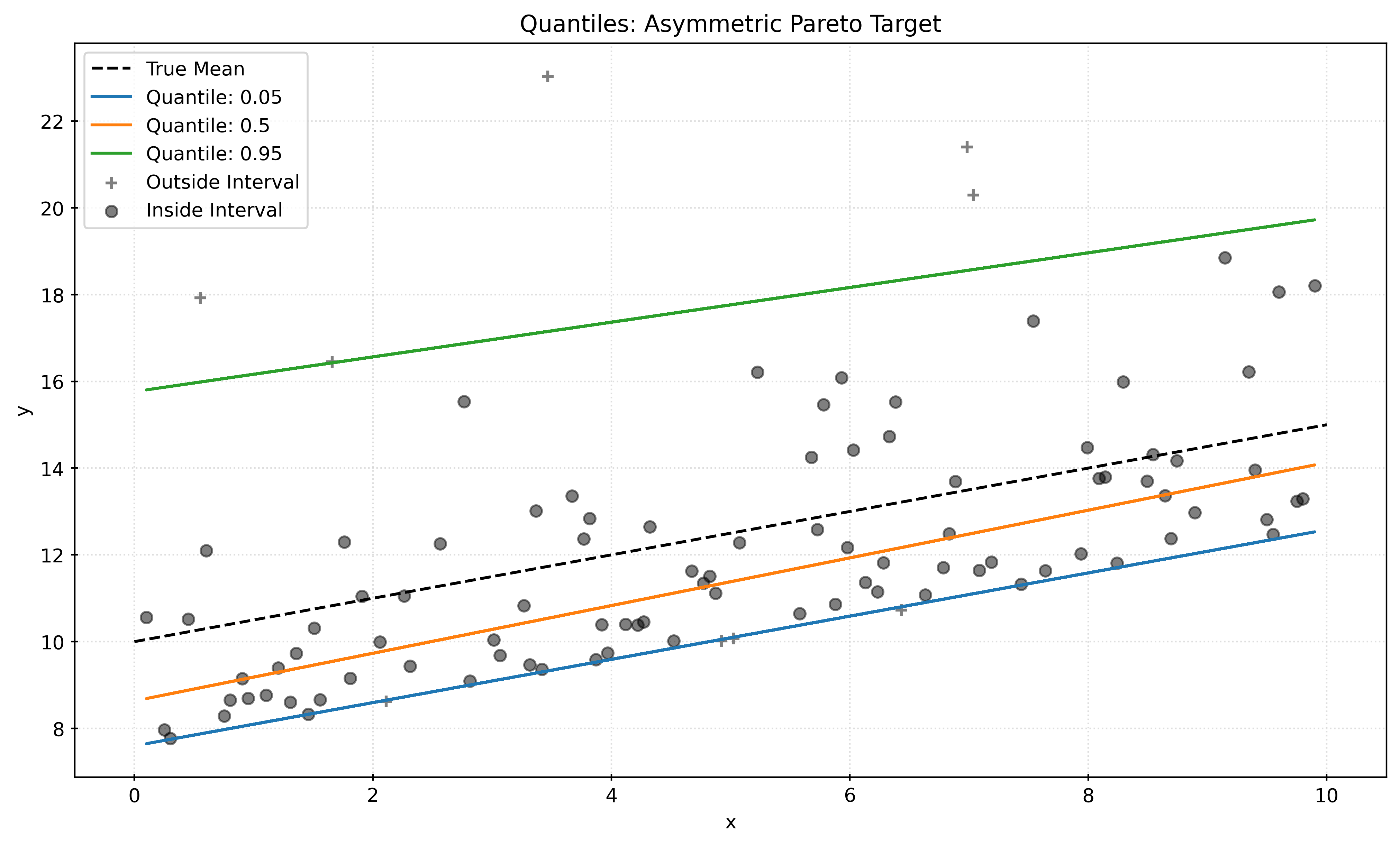
Non-Linear and Heteroscedastic Data
def generate_nonlinear_data(n_samples, seed=42):
    rng = np.random.RandomState(seed)
    x = np.linspace(start=0, stop=10, num=n_samples)
    X = x[:, np.newaxis]
    y_mean = x * np.sin(x)
    y = y_mean + rng.normal(
        loc=0,
        scale=0.5 + 0.5 * x,
        size=n_samples,
    )
    return X, y
X, y = generate_nonlinear_data(n_samples=300)X_train, X_test, y_train, y_test = train_test_split(
X,
y,
test_size=0.5,
random_state=42,
)Show Code for Plot
quantiles = [0.05, 0.5, 0.95]
predictions = {}
pred_outside = np.zeros_like(y_test, dtype=np.bool_)

for quantile in quantiles:
    qr = QuantileRegressor(quantile=quantile, alpha=0)
    qr.fit(X_train, y_train)
    y_pred = qr.predict(X_test)
    predictions[quantile] = y_pred
    if quantile == min(quantiles):
        pred_outside = np.logical_or(pred_outside, y_pred >= y_test)
    if quantile == max(quantiles):
        pred_outside = np.logical_or(pred_outside, y_pred <= y_test)

fig, ax = plt.subplots(figsize=(10, 6))
x = np.linspace(start=0, stop=10, num=1000)
ax.plot(
    x,
    x * np.sin(x),
    color="black",
    linestyle="--",
    label="True Mean",
)
for quantile, y_pred in predictions.items():
    ax.plot(X_test, y_pred, label=f"Quantile: {quantile}")
ax.scatter(
    X_test[pred_outside],
    y_test[pred_outside],
    color="black",
    marker="+",
    alpha=0.5,
    label="Outside Interval",
)
ax.scatter(
    X_test[~pred_outside],
    y_test[~pred_outside],
    color="black",
    alpha=0.5,
    label="Inside Interval",
)
# ax.legend()
ax.set_xlabel("x")
ax.set_ylabel("y")
ax.set_title("Quantiles: Non-Linear and Heteroscedastic Data")
plt.show()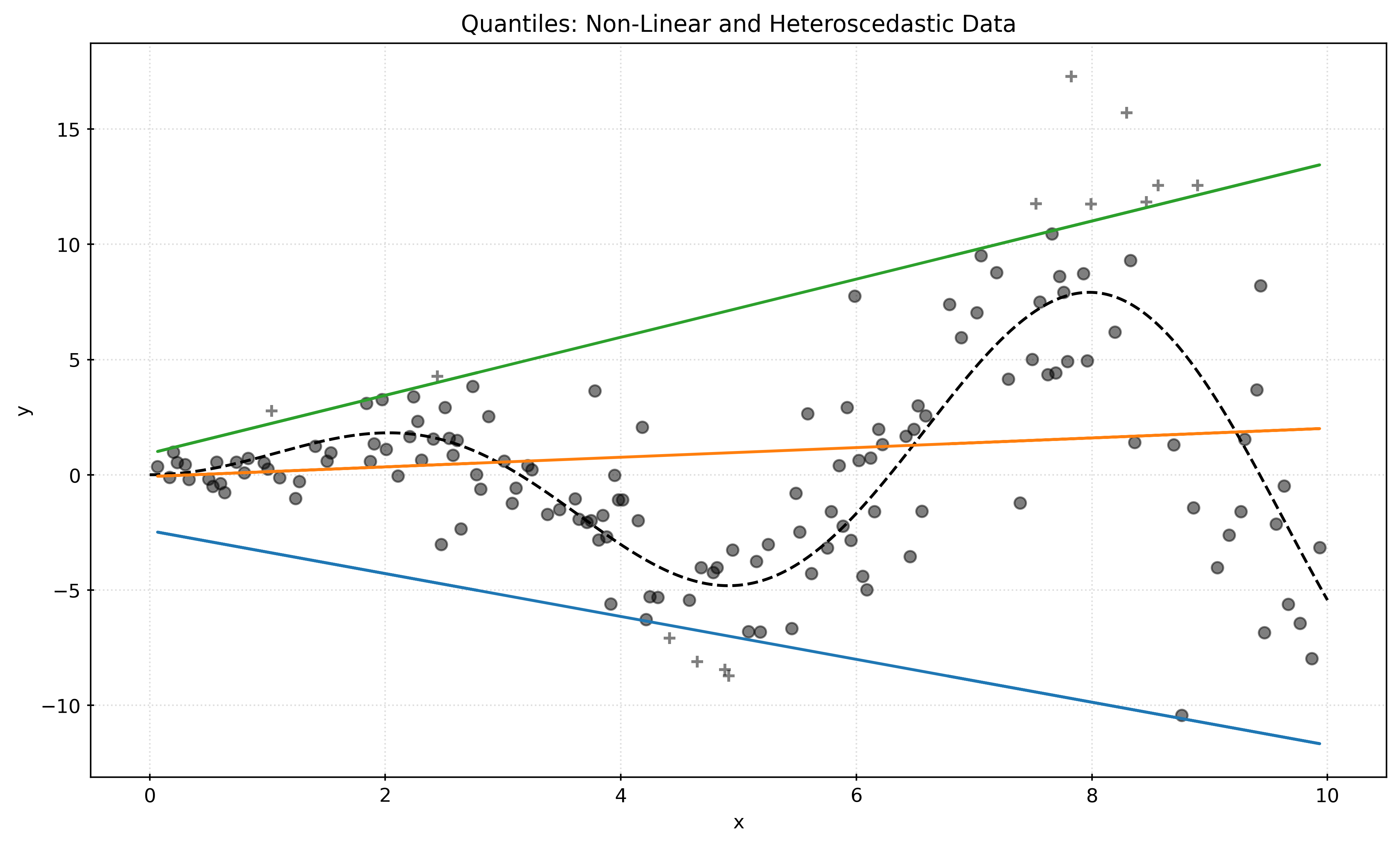
Show Code for Plot
quantiles = [0.05, 0.5, 0.95]
predictions = {}
pred_outside = np.zeros_like(y_test, dtype=np.bool_)

boost_params = {
    "max_iter": 500,
    "learning_rate": 0.1,
    "random_state": 42,
}

for quantile in quantiles:
    qr = HistGradientBoostingRegressor(
        loss="quantile",
        quantile=quantile,
        **boost_params,
    )
    qr.fit(X_train, y_train)
    y_pred = qr.predict(X_test)
    predictions[quantile] = y_pred
    if quantile == min(quantiles):
        pred_outside = np.logical_or(pred_outside, y_pred >= y_test)
    if quantile == max(quantiles):
        pred_outside = np.logical_or(pred_outside, y_pred <= y_test)

fig, ax = plt.subplots(figsize=(10, 6))
x = np.linspace(start=0, stop=10, num=1000)
ax.plot(
    x,
    x * np.sin(x),
    color="black",
    linestyle="--",
    label="True Mean",
)
for quantile, y_pred in predictions.items():
    qr = HistGradientBoostingRegressor(
        loss="quantile",
        quantile=quantile,
        **boost_params,
    )
    qr.fit(X_train, y_train)
    y_pred = qr.predict(x[:, np.newaxis])
    ax.plot(x, y_pred, label=f"Quantile: {quantile}")
ax.scatter(
    X_test[pred_outside],
    y_test[pred_outside],
    color="black",
    marker="+",
    alpha=0.5,
    label="Outside Interval",
)
ax.scatter(
    X_test[~pred_outside],
    y_test[~pred_outside],
    color="black",
    alpha=0.5,
    label="Inside Interval",
)
# ax.legend()
ax.set_xlabel("x")
ax.set_ylabel("y")
ax.set_title("Quantiles: Non-Linear and Heteroscedastic Data")
plt.show()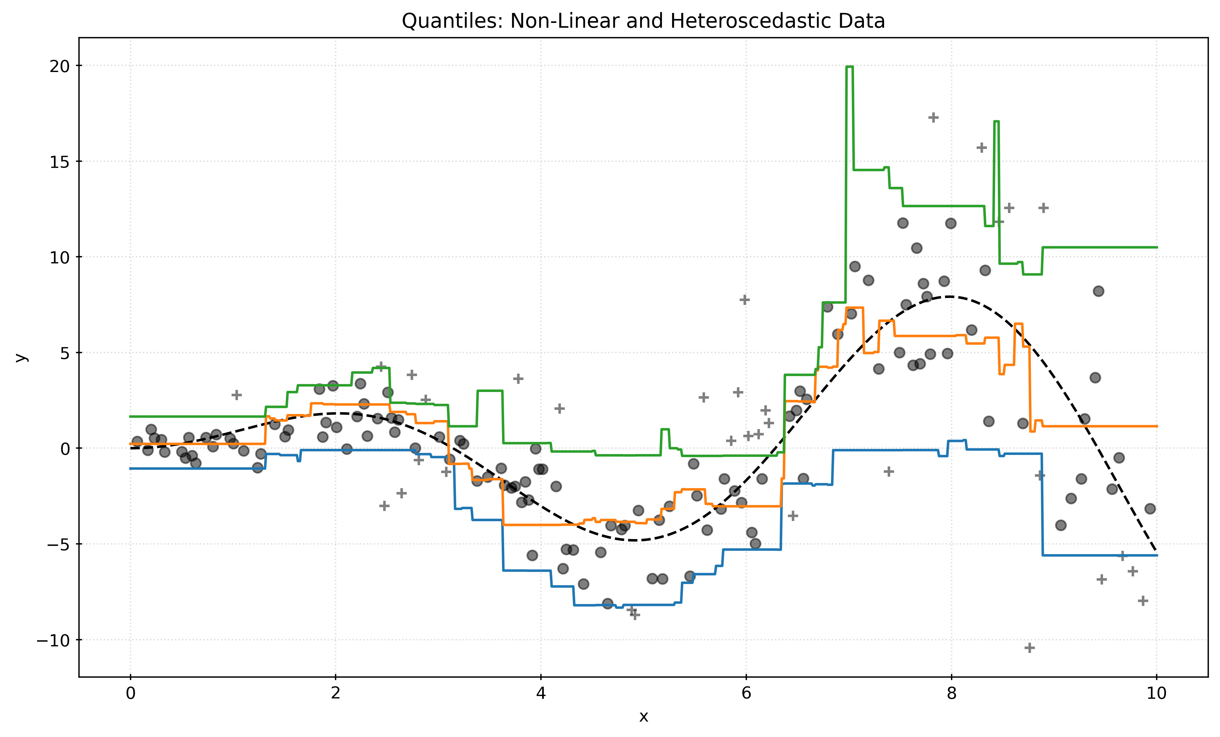
Footnotes
Minimizing the mean squared error (MSE) is equivalent to minimizing the sum of squared errors (SSE). Within
sklearn, a preference for MSE is found.↩︎Like MSE, minimizing the mean absolute error (MAE) is equivalent to minimizing the sum of absolute errors.↩︎
Notice that the quantile regression function is a function of the features, \(x\), for a fixed \(\tau\). Previously, when referred to the quantile function, \(Q(p)\), unqualified, it was a function of a probability \(p\), which returned the quantile. Notation sure can be annoying and confusing!↩︎