# basics
import numpy as np
import pandas as pd
import seaborn as sns
import matplotlib.pyplot as plt

# machine learning
from sklearn.model_selection import train_test_split
from sklearn.neighbors import KNeighborsRegressor
from sklearn.metrics import root_mean_squared_errorRegression Introduction
Definitions, Evaluation, and Tuning
Setup and Objectives
In this note, we will discuss:
- the supervised learning regression task,
- \(k\)-nearest neighbors,
- data splitting,
- and the process of evaluating the performance of predictions from a model.
Along the way, we will outline a general procedure that will be used for all supervised learning tasks.
The Goal of Regression
In the supervised learning regression task, we generally assume a data generating process that relates a response \(Y\) to features \(X\) through a functional relationship, \(f(X)\), plus some random noise, \(\epsilon\).
\[ \Large Y = f(X) + \epsilon \]
- We want to learn the signal, \(f\).
- We do not want to learn the noise, \(\epsilon\).
Stating this goal in terms of a data generating process is technically correct, but more statistical and theoretical than we will need. More practically, the goal of regression is to make good predictions of a numeric target (output) given unseen feature data (input).
Like the name suggests, a data generating process describes how to generate data, which in the case of supervised learning, is thought of as an \((X, Y)\) pair.
Consider the following example of a data generating process.
\[ \begin{aligned} X &\sim \text{Uniform}(-2\pi, 2\pi) \\ \epsilon &\sim N(\mu=0, \sigma=0.25) \\ Y &= \sin(X) + \epsilon \end{aligned} \]
Here, \(X\) is a feature and \(Y\) is the target. The relationship between \(X\) and \(Y\) is the sine function, \(\sin(X)\), plus some noise, \(\epsilon\). The noise is normally distributed with a mean of 0 and a standard deviation of 0.25.
You can think of the data generation as a step-by-step process. Repeat the following \(n\) times to create a dataset of size \(n\):
- First, randomly generate \(x\), in this case from a uniform distribution.
- Second, randomly generate the noise, \(\epsilon\), in this case from a normal distribution.
- Lastly, create \(y\) by applying the sine function to \(x\) and then adding the noise.
- Here, the sine function is the “signal” we want to learn. That is, the functional relationship, \(f\), between \(x\) and \(y\).
We can translate this to Python code that can simulate data according to this data generating process, which we write as a function for repeated usage.
def simulate_sin_data(n, sd, seed):

    # control randomness
    np.random.seed(seed)

    # simulate X data
    X = np.random.uniform(low=-2 * np.pi, high=2 * np.pi, size=(n, 1))

    # generate signal portion of y data
    signal = np.sin(X).ravel()

    # generate noise
    noise = np.random.normal(loc=0, scale=sd, size=n)

    # combine signal and noise
    y = signal + noise

    # return simulated data
    return X, y
X, y = simulate_sin_data(
n=100,
sd=0.25,
seed=42,
)print(X[:10])[[-1.57657536]
[ 5.66384302]
[ 2.91532185]
[ 1.23977908]
[-4.32259725]
[-4.32290035]
[-5.55328511]
[ 4.60150516]
[ 1.27064871]
[ 2.61471713]]print(y)[-0.97822153 -0.65525158 0.24728514 0.44881999 0.87007025 1.0143815
1.03626877 -1.12342624 0.75316945 0.3773958 0.48464786 -0.28698982
-0.99281494 0.58410786 0.77996312 0.98470729 -0.80557145 0.22418905
-0.85273188 -0.86110969 1.06041368 1.048723 -0.50391436 -1.05276098
-0.87826871 -0.53294033 0.50541814 -0.02264646 0.87700631 0.65213874
1.44758603 0.88442496 0.79379989 -0.6176688 -0.89827228 -0.67635667
-0.61861924 1.55742173 0.68744214 -0.6077621 0.99062952 -0.35274114
0.70451974 -0.72044694 0.0876492 0.66353249 -0.34936338 -0.10094504
0.70056222 1.27783333 -0.62060677 -0.45217841 -0.66421061 -1.09498935
0.55490561 -0.81433421 0.63102339 0.7462571 0.30838011 -0.42396635
-1.18107933 -0.34558859 -0.63234187 -1.28154308 -0.32215267 0.83794647
0.57817397 -0.56373536 0.87065572 0.03141684 -0.58514738 0.27065089
0.19982268 -0.65867952 0.57859918 0.3473666 -0.43412584 0.85996577
-0.90522404 0.81483641 -0.52240253 1.11822955 -1.14814667 0.88058662
-0.93716369 -0.61359777 0.54312915 0.78240453 -0.74740257 -0.23891108
1.20320864 0.91982981 -0.19646143 0.50772415 -0.48282194 -0.28184044
0.26252413 -0.70455099 0.38319451 1.18377377]# verify shapes of the data
X.shape, y.shape((100, 1), (100,))In general, when working with ML data in Python, especially with sklearn:
Xwill contain the features, usually as a two-dimensionalnumpyarray- Here, we have a single feature so
Xhas shape(100, 1).
- Here, we have a single feature so
ywill contain the target, usually as a one-dimensionalnumpyarray- Here,
yhas shape(100,).
- Here,
The following table displays this data in a more human readable format.
| x | y | |
|---|---|---|
| 0 | -1.58 | -0.98 |
| 1 | 5.66 | -0.66 |
| 2 | 2.92 | 0.25 |
| 3 | 1.24 | 0.45 |
| 4 | -4.32 | 0.87 |
| ... | ... | ... |
| 95 | -0.08 | -0.28 |
| 96 | 0.29 | 0.26 |
| 97 | -0.91 | -0.70 |
| 98 | -5.96 | 0.38 |
| 99 | -4.93 | 1.18 |
100 rows × 2 columns
This will be the starting point of regression tasks. Given the feature data, X, and the target data, y, we want to learn the relationship between the two well enough to make good predictions of \(y\) given new \(x\) values.
We can also visualize this data.
Show Code for Plot
# setup figure
fig, axs = plt.subplots(1, 2, figsize=(12, 5))

# add overall title
fig.suptitle("Simulated Sine Wave Data")

# x values to make predictions at for plotting purposes
x_plot = np.linspace(-2 * np.pi, 2 * np.pi, 1000).reshape((-1, 1))

# create subplot for "simulation study"
axs[0].set_title("Simulation Study")
axs[0].plot(x_plot, np.sin(x_plot), color="tab:gray", zorder=1)
axs[0].scatter(X, y, s=50, alpha=0.75)

# create subplot for "reality"
axs[1].set_title("Reality")
axs[1].scatter(X, y, s=50, alpha=0.75)

# show plot
plt.show()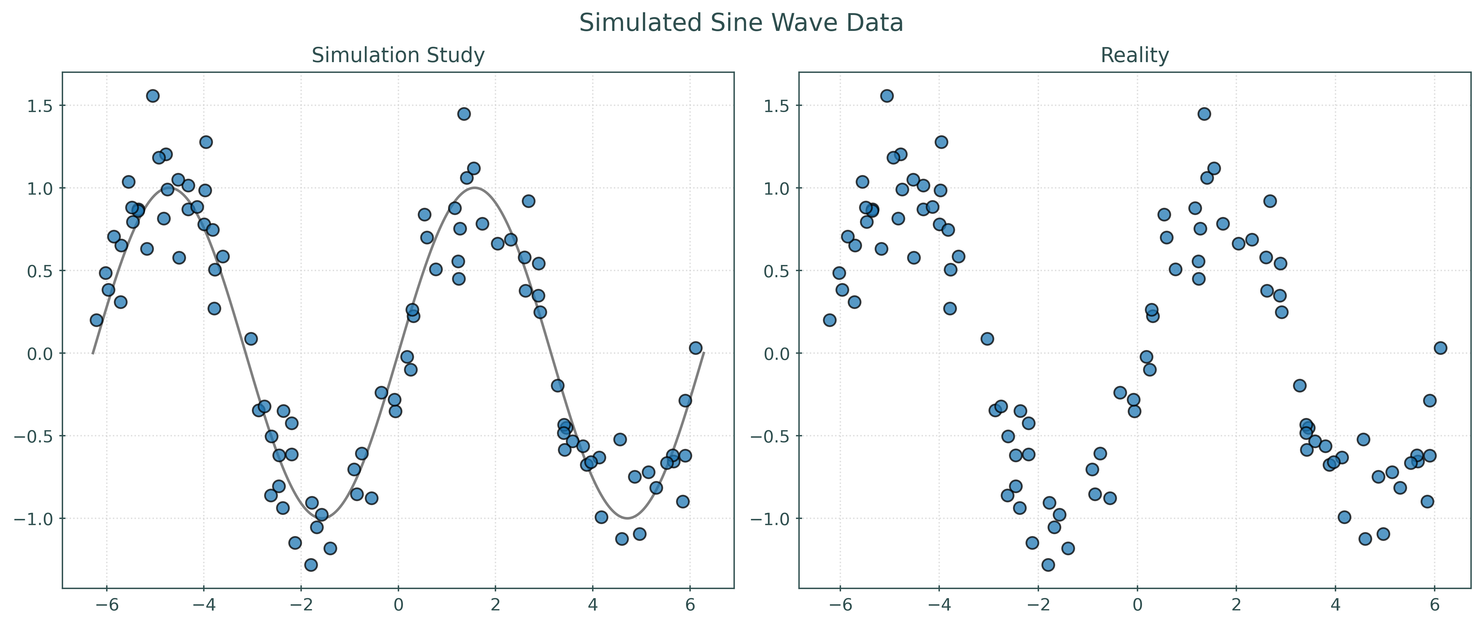
In some sense, the left panel visualizes the data generating process. The sine wave is the signal, and the points are randomly placed around the sine wave according to the distribution of the noise. The right panel shows the reality that we will face when dealing with the regression task. We only have access to the data, and instead need to infer how it was generated. So, another way of thinking about the regression task is inferring the left panel, specifically the unknown signal, from the right panel.
So, if \(f\) is a function that describes the true signal within the data generating process, our goal is to use the data to estimate \(f\) with \(\hat{f}\), a function that approximates \(f\) well enough to make good predictions of \(Y\) given new \(X\) values.
Thinking about the right panel, without seeing the left…
- When \(x = -\pi\), what should we predict for \(y\)?
- When \(x = 0\), what should we predict for \(y\)?
- When \(x = \pi\), what should we predict for \(y\)?
You can probably make some reasonable estimates, but how can we formalize this process? How can a machine learn to make these predictions? How can a machine learn to estimate \(f\)?
\(k\)-Nearest Neighbors
Before specifically introducing \(k\)-Nearest Neighbors (KNN), let’s discuss a simple but important general concept in machine learning, that you probably used when thinking about the predictions above.
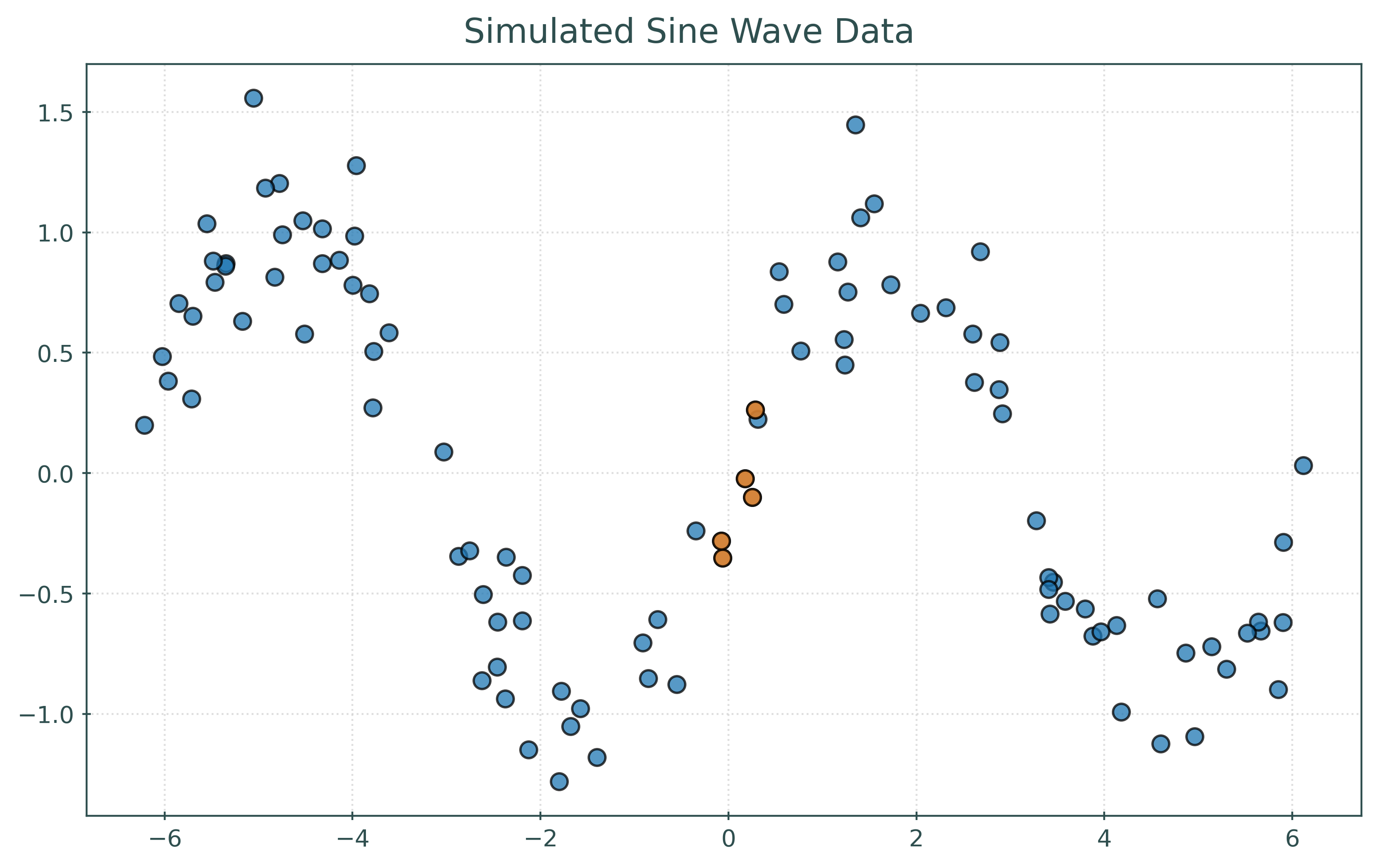
To predict \(y\) at \(x = 0\), find some “nearby” samples in the data, with respect to \(x\). Predict the average of the \(y\) values of these samples.
Here, we’ve highlighted five points that are “nearby” to \(x = 0\). We then average their \(y\) values to predict \(y\) at \(x = 0\).
# get the "distance" of each point from x = 0
distances = np.abs(X).ravel()

# get the indexes for the five nearest neighbors
nearest_indices = np.argsort(distances)[:5]
# X values of the five nearest neighbors
print(X[nearest_indices])[[-0.06060874]
[-0.07796684]
[ 0.17887523]
[ 0.25218219]
[ 0.28566916]]# y values of the five nearest neighbors
print(y[nearest_indices])[-0.35274114 -0.28184044 -0.02264646 -0.10094504 0.26252413]# average of the y values, use as prediction
print(np.mean(y[nearest_indices]))-0.09912979149490428Because we know the data generating process, we know that at \(x = 0\), \(y = \sin(0) = 0\), so our prediction here seems reasonably close. Of course in practice, we’ll need some other way to check our predictions.
Two questions arise:
- How is “nearby” defined? Distance, most often the Euclidean distance.
- How many “nearby” samples should we use? Good question!
If we formalize this process by picking a distance metric and a number of “nearby” samples, which we will call neighbors, we are describing \(k\)-nearest neighbors (KNN).
For some \(k\), which determines the number of neighbors to use, predict \(y\) at \(x\) using
\[ \hat{f}(x) = \frac{1}{k} \sum_{ \{i \ : \ x_i \in \mathcal{N}_k(x, \mathcal{D}) \} } y_i. \]
Here, we have:
- \(\mathcal{D} = \{ (x_i, y_i) \in \mathbb{R}^p \times \mathbb{R}, \ i = 1, 2, \ldots n \}\), the data used to fit the model, where \(p\) is the number of features.
- \(\{i \ : \ x_i \in \mathcal{N}_k(x, \mathcal{D}) \}\), the indexes of the samples that contain a value that is among the nearest neighbors to the point.
Don’t let this notation scare you! This is just a mathematical way of saying: find the \(k\) closest points to \(x\) and average their \(y\) values.
While it is simple enough to implement KNN in Python, we will instead use the KNeighborsRegressor class from sklearn.
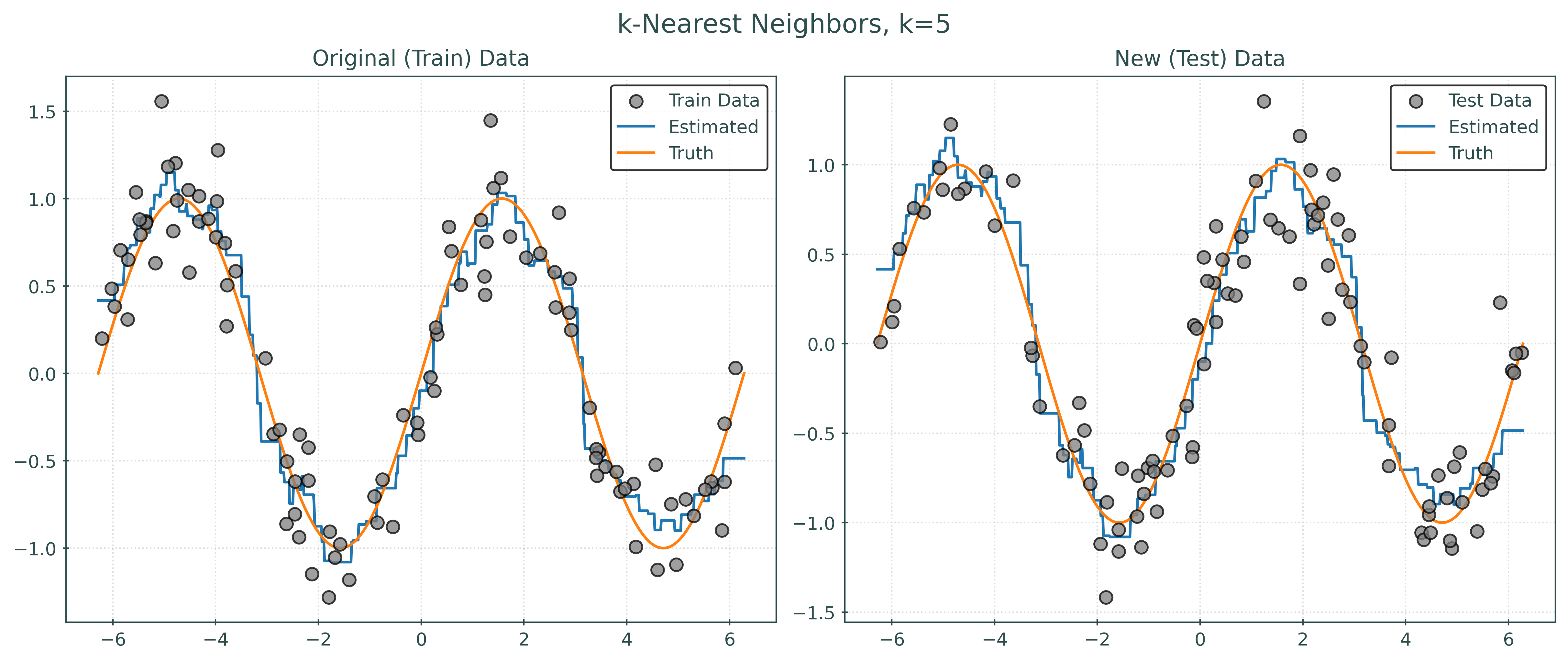
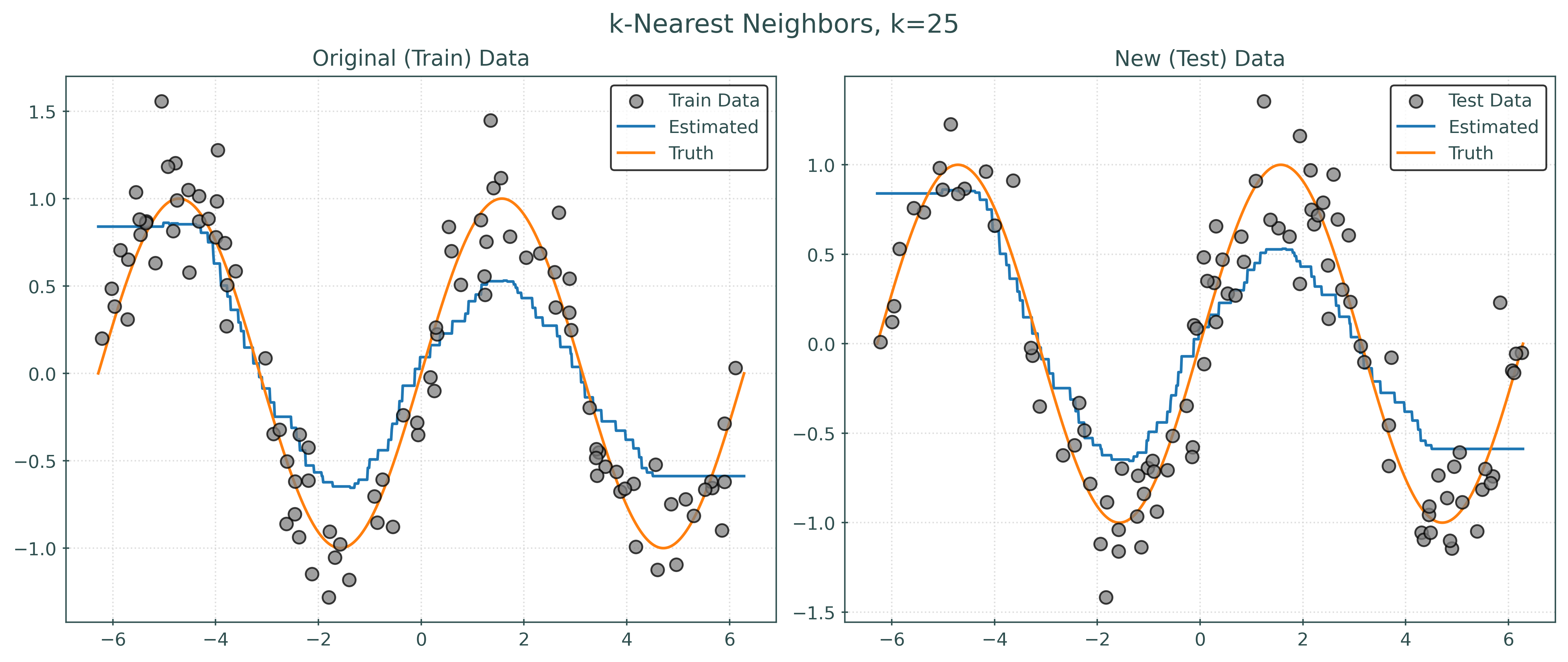
Let’s use sklearn to fit a KNN model to the simulated data.
knn = KNeighborsRegressor(
    n_neighbors=5, # this is k
    metric="euclidean",
)knn.get_params(){'algorithm': 'auto',
'leaf_size': 30,
'metric': 'euclidean',
'metric_params': None,
'n_jobs': None,
'n_neighbors': 5,
'p': 2,
'weights': 'uniform'}_ = knn.fit(X, y)knn.predict(X)array([-1.07976579, -0.69120201, 0.4870013 , 0.81629748, 0.87915473,
0.87915473, 0.73423483, -0.89620712, 0.81629748, 0.55326411,
0.41611298, -0.48594072, -0.70478567, 0.67685346, 0.93463716,
0.93463716, -0.64292642, 0.24021363, -0.65644495, -0.62227348,
0.96564374, 0.90039565, -0.62227348, -1.07976579, -0.65644495,
-0.49744278, 0.67685346, 0.00207611, 0.81629748, 0.7163788 ,
0.85297895, 0.95939979, 0.88825536, -0.69120201, -0.61575785,
-0.61281075, -0.64292642, 1.07805279, 0.64535989, -0.65644495,
1.04823427, -0.19941683, 0.50657619, -0.80827673, -0.38902322,
0.76604158, -0.66486311, 0.24021363, 0.5065892 , 0.81188234,
-0.48594072, -0.49744278, -0.72994749, -0.90011986, 0.81629748,
-0.78232998, 1.02056808, 0.75697335, 0.7163788 , -0.69444757,
-1.07976579, -0.38902322, -0.70478567, -1.07317926, -0.38902322,
0.5065892 , 0.90039565, -0.61281075, 0.80720628, -0.48594072,
-0.430147 , 0.67685346, 0.41611298, -0.70478567, 0.58212671,
0.4870013 , -0.430147 , 0.80720628, -1.07317926, 1.14997402,
-0.89620712, 1.03236065, -0.69444757, 0.88825536, -0.66486311,
-0.69444757, 0.4870013 , 1.01443326, -0.84173352, -0.47190469,
1.04823427, 0.55326411, -0.430147 , 0.62948564, -0.430147 ,
-0.19941683, 0.24021363, -0.8448786 , 0.41611298, 1.14997402])Show Code for Plot
# setup figure
fig, ax = plt.subplots(1, 1, figsize=(8, 5))

# add overall title
fig.suptitle("Simulated Sine Wave Data")

# x values to make predictions at for plotting purposes
x_plot = np.linspace(-2 * np.pi, 2 * np.pi, 1000).reshape((-1, 1))

# create scatterplot of data
ax.plot(
    x_plot,
    knn.predict(x_plot),
    color="tab:gray",
    label="k = 5",
    zorder=1,
)
ax.scatter(X, y, s=50, alpha=0.75)
ax.legend()

# show plot
plt.show()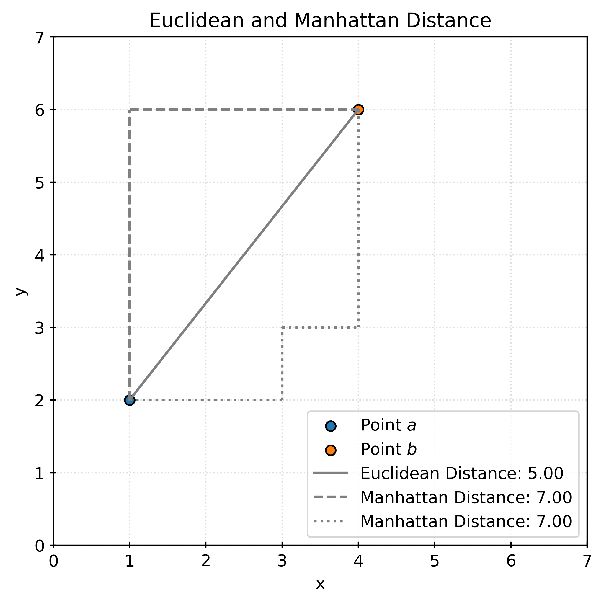
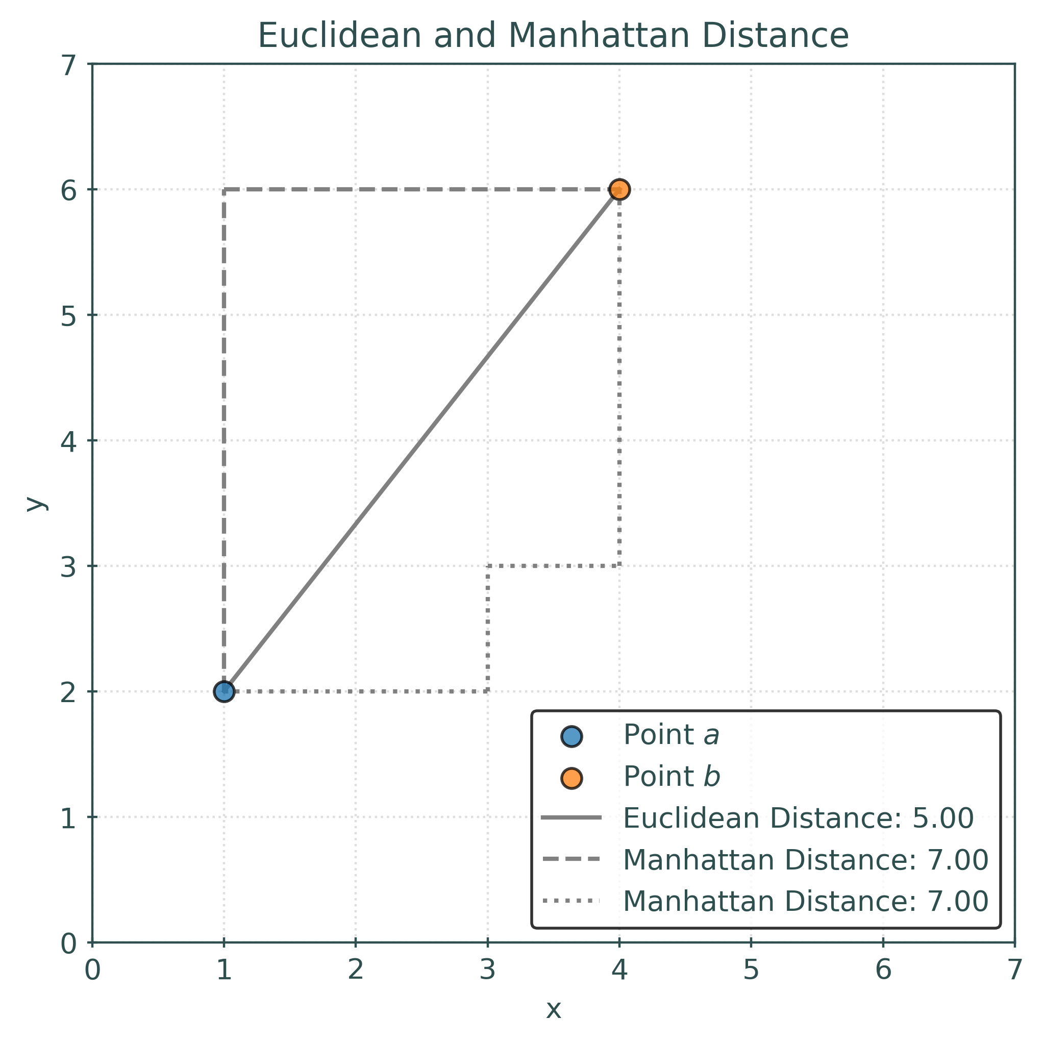
Distance Metrics
Given two vectors \(a\) and \(b\):
\[ \begin{aligned} a &= (a_{1},a_{2},\ldots ,a_{n}) \in \mathbb {R}^{n} \\ b &= (b_{1},b_{2},\ldots ,b_{n}) \in \mathbb {R}^{n} \end{aligned} \]
The Euclidean distance between \(a\) and \(b\) is defined to be
\[ d(a, b) = \left(\sum _{i=1}^{n}|a_{i}-b_{i}|^{2}\right)^{\frac{1}{2}} = \sqrt{\sum _{i=1}^{n}|a_{i}-b_{i}|^{2}}. \]
The Manhattan distance between \(a\) and \(b\) is defined to be
\[ d(a, b) = \sum _{i=1}^{n}|a_{i}-b_{i}|. \]
The Minkowski distance between \(a\) and \(b\) is defined to be
\[ d(a, b) = \left(\sum _{i=1}^{n}|a_{i}-b_{i}|^{p}\right)^{\frac {1}{p}} \]
For example, with two points in three dimensions:
\[ \begin{aligned} a &= (a_1, a_2, a_3) = (1, 2, 3)\\ b &= (b_1, b_2, b_3) = (4, 5, 6) \end{aligned} \]
The Euclidean distance between \(a\) and \(b\) is calculated as:
\[ \begin{aligned} d(a, b) &= \sqrt{\sum _{i=1}^{3}|a_{i}-b_{i}|^{2}} \\ &= \sqrt{(1 - 4)^2 + (2 - 5)^2 + (3 - 6)^2} \\ &= \sqrt{9 + 9 + 9} \\ &= \sqrt{27} \\ &\approx 5.19615 \end{aligned} \]
The following plot shows the distance between \((1, 2)\) and \((4, 6)\). The Euclidean distance is shown in solid gray, while the Manhattan distance is shown in dashed gray. The Euclidean distance is the “shortest” path between two points, while the Manhattan distance is the sum of the horizontal and vertical distances. The Manhattan distance (also known as the taxicab distance) gets its name from the grid-like layout of Manhattan streets.
Evaluating Regression
How do we quantify the performance of a model? Generally, we compare predicted values to actual values, but there are many ways to do so.
Metrics
- \(y\) is a vector of the true (actual) values of length \(n\)
- \(y_i\) is a particular elements of this vector
- \(\hat{y}\) is a vector of the predicted values of length \(n\)
- \(\hat{y}_i\) is a particular elements of this vector
- \(n\) is the number of samples, which is the same for the actual and predicted values
- \(\bar{y} = \frac{1}{n} \sum_{i=1}^{n} y_i\)
Root Mean Squared Error
\[ \text{RMSE}(y, \hat{y}) = \sqrt{\frac{1}{n} \sum_{i=1}^{n} (y_i - \hat{y}_i)^2} \]
def rmse(y_true, y_pred):
    return np.sqrt(np.mean((y_true - y_pred) ** 2))
Mean Absolute Error
\[ \text{MAE}(y, \hat{y}) = \frac{1}{n} \sum_{i=1}^{n} |y_i - \hat{y}_i| \]
Mean Absolute Percentage Error
\[ \text{MAPE}(y, \hat{y}) = \frac{1}{n} \sum_{i=1}^{n} \left| \frac{y_i - \hat{y}_i}{y_i} \right| \]
Coefficient of Determination
\[ R^2(y, \hat{y}) = 1 - \frac{\sum_{i=1}^{n} (y_i - \hat{y}_i)^2}{\sum_{i=1}^{n} (y_i - \bar{y})^2} \]
Maximum Error
\[ \text{MaxError}(y, \hat{y}) = \max |y_i - \hat{y}_i| \]
Comparing Models
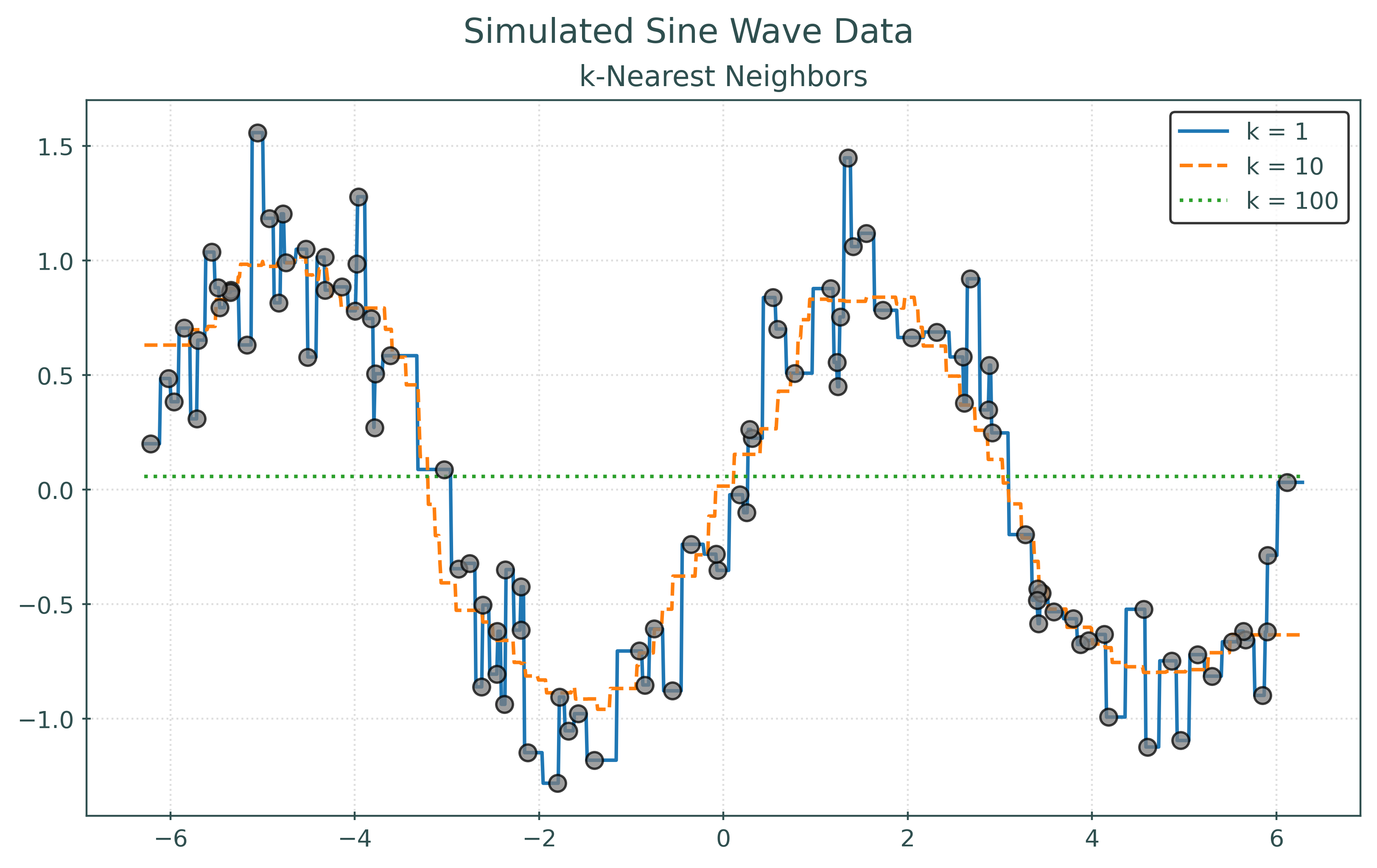
RMSE with k = 1:   0.00
RMSE with k = 10:  0.26
RMSE with k = 100: 0.75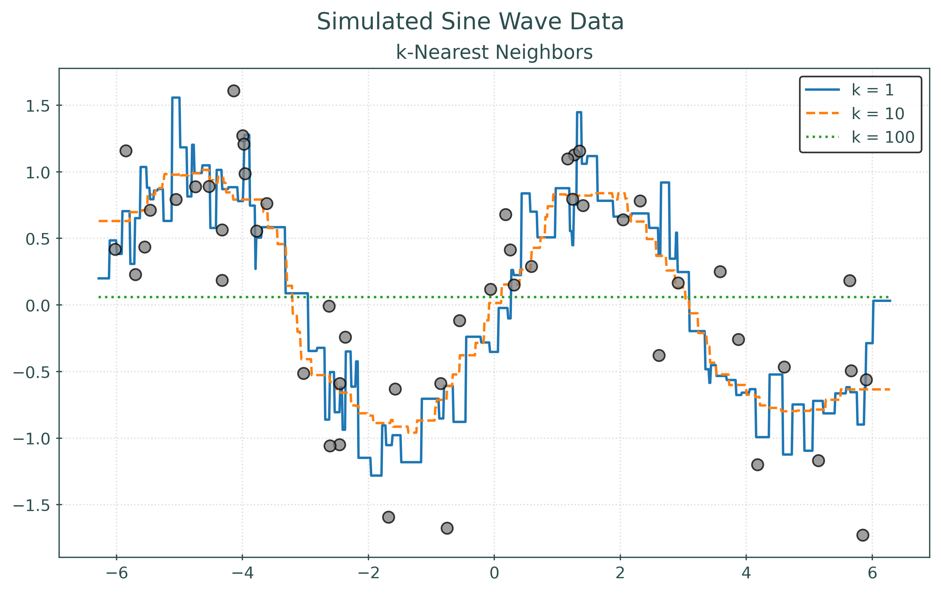
RMSE with k = 1: 0.49
RMSE with k = 10: 0.43
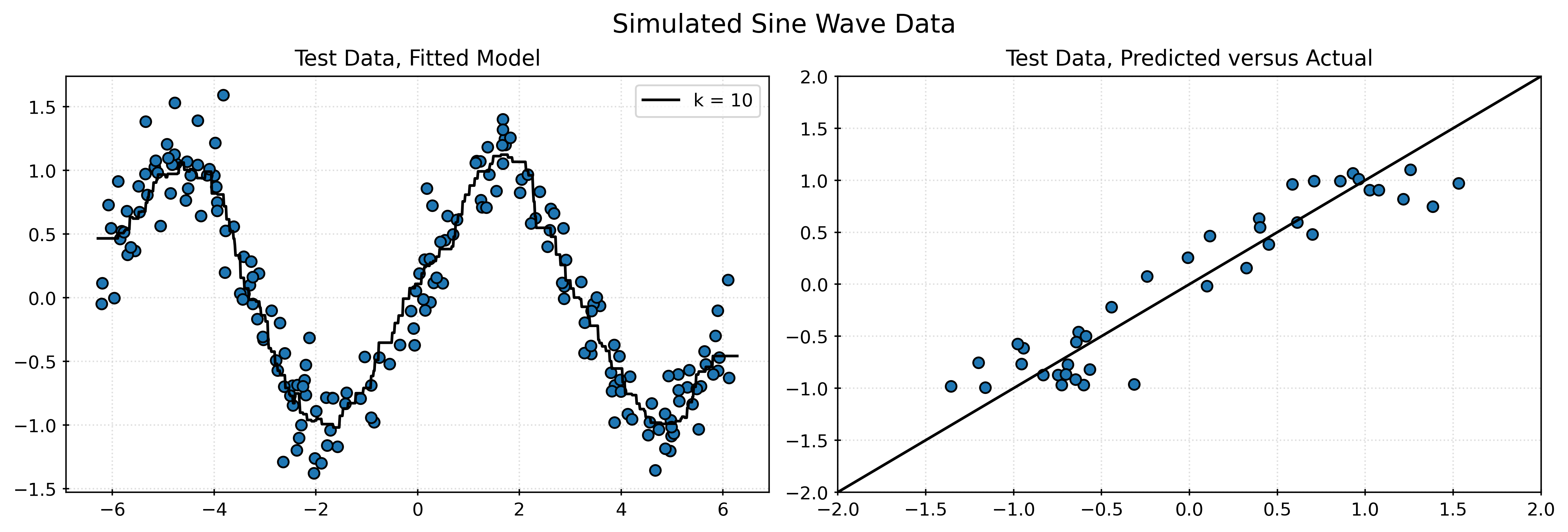
RMSE with k = 100: 0.83In the two preceding plots, the first plots the points that were used to fit the models. In the second, the plot displays the same learned models, but plots “new” unseen data. For illustrative purposes, we simply simulated new data. However, in practice, we will not be able to do so. Notice how the model with the best (lowest) RMSE changes!
Generalization
A model generalizes well if it is able to make good predictions on unseen data. Predicting on already observed data is easy!

Data Splitting
Train-Test Split
In practice, we cannot simply simulate more data!
However, the “easy” solution here is to take the available data and (randomly) use some of the data for training, that is the data used to fit a model. Then, (randomly) reserve some other data for testing. That is, the data we will calculate metrics on.
But, we actually need to go one step further…
Train-Validation-Test Split
- Train: The data used to train and select models.
- Validation-Train: The data used to fit models during training.
- Validation: The data used to evaluate models during training.
- Test: The data used only for a final evaluation of an already chosen model.
Train-Validation-Test Split Flowchart
flowchart TB
  A("Full Data")
  A -->|"80%"| B("Train Data")
  B -->|"80%"| D("(Validation) <br> Train Data")
  B -->|"20%"| E("Validation Data")
  A -->|"20%"| C("Test Data")
An 80-20 split is common, but not required. The choice of how much data to put into each set is called data budgeting.
Validation and Test Metrics
Now that we have a desire to fit a model to some data, but calculate metrics based on other data, we need to update our metric definitions.
Root Mean Squared Error (\(\text{RMSE}\), rmse)
\[ \text{RMSE}(f, \mathcal{D}) = \sqrt{ \frac{1}{n_\mathcal{D}} \sum_{i \in \mathcal{D}} \left( y_i - f(x_i) \right) ^ 2} \]
Importantly, now we need to consider both a dataset and function (learned from data) when calculating metrics. We’re still comparing “true” values to “predicted” values, but we need to pay attention to where they come from.
Here:
- \(f\) is a function that outputs predictions. In
sklearn, a function likesome_model.predict(). - \(\mathcal{D}\) is a dataset, usually either the validation or test data.
- \(n_\mathcal{D}\) is the number of observations in the dataset \(\mathcal{D}\).
- \(i\) is the index of an observation (row) of the dataset \(\mathcal{D}\). \(x_i\) is the feature value(s) for this observation and \(y_i\) is the target value.
Validation metrics use:
- models fit to validation-train data.
- validation data.
Test metrics…
- models fit to train data.
- test data
Example
Data Setup
We’ll return to our simulated data from earlier, this time starting with a larger number of samples.
X, y = simulate_sin_data(
    n=500,
    sd=0.25,
    seed=42,
)
X.shape, y.shape # verify shapes of the data((500, 1), (500,))We first split the full data into a train and test set.
X_train, X_test, y_train, y_test = train_test_split(
    X,
    y,
    test_size=0.20,
    random_state=42,
)
X_train.shape, X_test.shape # verify shapes of the data((400, 1), (100, 1))We then repeat the process, splitting the train set into a (validation) train and validation set.
X_vtrain, X_validation, y_vtrain, y_validation = train_test_split(
    X_train,
    y_train,
    test_size=0.20,
    random_state=42,
)
X_vtrain.shape, X_validation.shape # verify shapes of the data((320, 1), (80, 1))Create Models
knn001 = KNeighborsRegressor(n_neighbors=1)
knn010 = KNeighborsRegressor(n_neighbors=10)
knn100 = KNeighborsRegressor(n_neighbors=100)
Fit Models using .fit()
_ = knn001.fit(X_vtrain, y_vtrain)
_ = knn010.fit(X_vtrain, y_vtrain)
_ = knn100.fit(X_vtrain, y_vtrain)
Predictions using .predict()
knn010.predict(X_validation)array([-0.71999414, 0.07184204, -0.76863261, 1.01935859, -0.75851946,
0.95700314, -0.74950339, 0.89408371, 0.75420993, 0.07184204,
0.96620818, 0.39564778, 0.91541781, -0.81191631, 0.83495551,
0.23832782, -0.78065101, -0.59753152, -0.80367995, 1.00889988,
0.98538151, -0.78115394, -0.29861791, 0.66568191, -0.78552582,
-0.76863261, 0.59787286, 0.9467219 , 0.17060996, 0.46833033,
-0.81433526, -0.05347379, -0.8775873 , 0.82655124, -0.71999414,
0.01845914, 0.83875697, -0.8998143 , 0.07463585, -0.08361703,
0.17060996, 0.87593598, 0.78931816, -1.06324465, -0.72531582,
0.78755612, -0.77183195, -1.01506244, 0.54664385, -0.36342481,
-1.01506244, -0.29861791, 0.44542323, 0.9710132 , -1.01938407,
0.03690414, 0.98538151, -0.59753152, 0.84696752, 0.22386489,
-0.40696691, -0.6492984 , 0.29458683, -0.45768811, 0.7624059 ,
-0.71999414, 0.54664385, 1.00790469, 0.59216818, -0.81191631,
-0.71767568, -0.30390655, 0.87378872, 0.75420993, 0.60218228,
-0.36342481, -0.99256822, -1.01506244, -0.45768811, 0.90455151])print(knn010.predict(X_validation))[-0.71999414 0.07184204 -0.76863261 1.01935859 -0.75851946 0.95700314
-0.74950339 0.89408371 0.75420993 0.07184204 0.96620818 0.39564778
0.91541781 -0.81191631 0.83495551 0.23832782 -0.78065101 -0.59753152
-0.80367995 1.00889988 0.98538151 -0.78115394 -0.29861791 0.66568191
-0.78552582 -0.76863261 0.59787286 0.9467219 0.17060996 0.46833033
-0.81433526 -0.05347379 -0.8775873 0.82655124 -0.71999414 0.01845914
0.83875697 -0.8998143 0.07463585 -0.08361703 0.17060996 0.87593598
0.78931816 -1.06324465 -0.72531582 0.78755612 -0.77183195 -1.01506244
0.54664385 -0.36342481 -1.01506244 -0.29861791 0.44542323 0.9710132
-1.01938407 0.03690414 0.98538151 -0.59753152 0.84696752 0.22386489
-0.40696691 -0.6492984 0.29458683 -0.45768811 0.7624059 -0.71999414
0.54664385 1.00790469 0.59216818 -0.81191631 -0.71767568 -0.30390655
0.87378872 0.75420993 0.60218228 -0.36342481 -0.99256822 -1.01506244
-0.45768811 0.90455151]knn010.predict(X_validation).shape(80,)Validation Metrics
# model from train, data from validation
rmse_val_001 = rmse(y_validation, knn001.predict(X_validation))
rmse_val_010 = rmse(y_validation, knn010.predict(X_validation))
rmse_val_100 = rmse(y_validation, knn100.predict(X_validation))

print(f"Validation RMSE with k = 1:   {rmse_val_001:.3f}")
print(f"Validation RMSE with k = 10:  {rmse_val_010:.3f}")
print(f"Validation RMSE with k = 100: {rmse_val_100:.3f}")
Validation RMSE with k = 1: 0.353
Validation RMSE with k = 10: 0.261
Validation RMSE with k = 100: 0.449Based on these results, we would select the model with the \(k\) value of 10. This will be our chosen model.
Refit and Calculate Test Metric
# refit to (full) train data
knn010.fit(X_train, y_train)

# calculate test RMSE
rmse_test_010 = rmse(y_test, knn010.predict(X_test))

# print
print("Test RMSE with k = 10:", rmse_test_010)
Test RMSE with k = 10: 0.2720220479053038Visualizing Test Results
# calculate residuals
residuals = y_test - knn010.predict(X_test)

# plot histogram of residuals
fig, ax = plt.subplots(figsize=(10, 5))
ax.hist(residuals, bins=15, edgecolor="black", alpha=0.75)
ax.set_title("Histogram of Residuals")
ax.set_xlabel("Residual")
ax.set_ylabel("Frequency")
plt.show()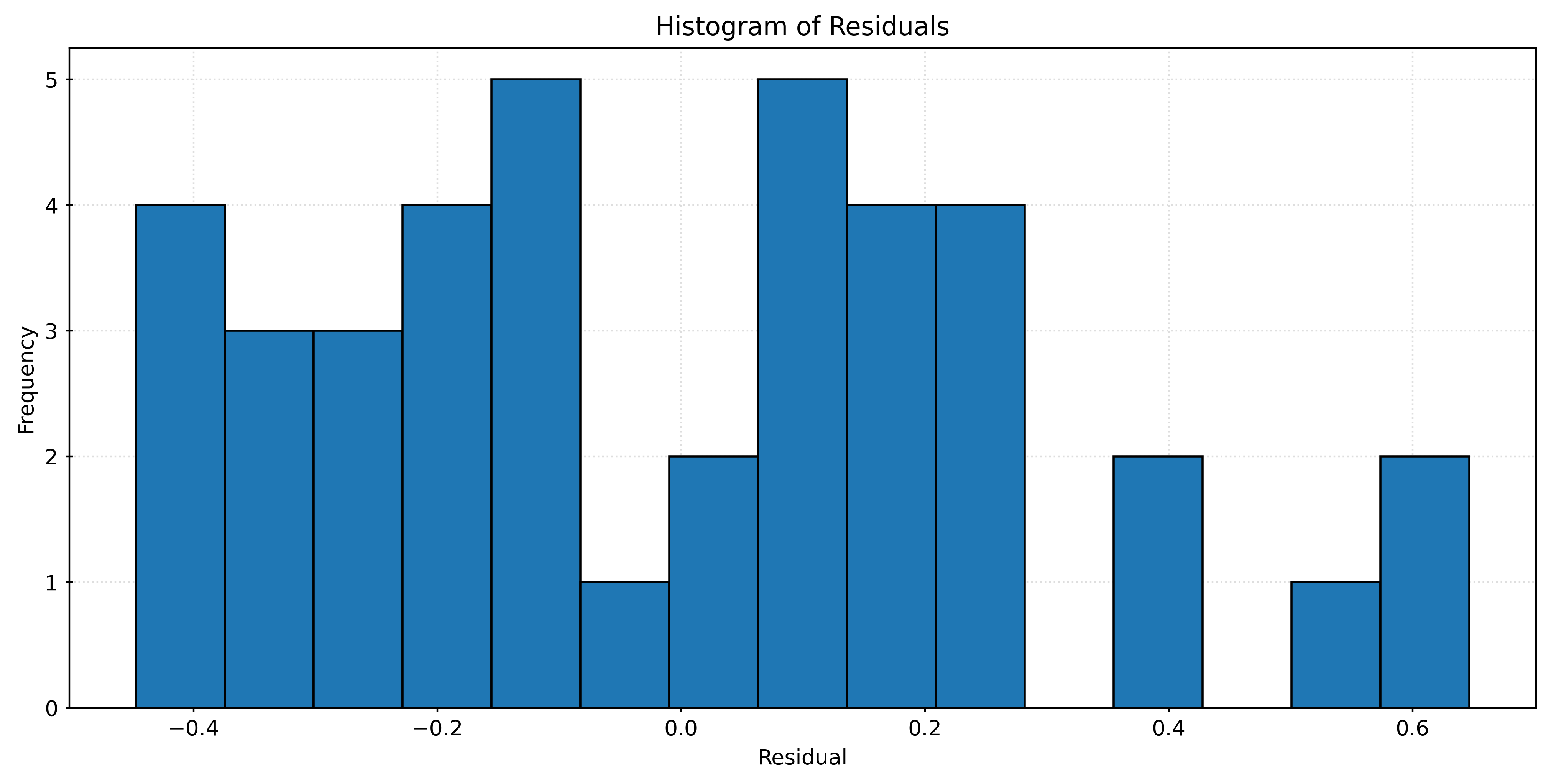
A Process for Supervised Learning
flowchart TB
    Pipeline{ML Pipeline} --> Model{Tuned Model}
    Model -- Predictions --> Metric[Evaluation]
    Estimator["Estimator"] --> Pipeline
    Data[(Data)] --> TrainData[(Train Data)]
    Data --> TestData[(Test Data)]
    TrainData -- Train Features --> Pipeline
    TrainData -- Train Target --> Pipeline
    TestData -- Test Features --> Model
    TestData -- Test Target --> Metric
The tuning procedure for supervised learning is:
- Train-test split the available data.
- Further split the train data into (validation) train and validation datasets.
- Fit all candidate models (in this case, three KNN models) to the (validation) train dataset.
- Calculate validation RMSE. With the validation data, calculate the RMSE for predictions from these models.
- Choose the model with the lowest validation RMSE. Call this the tuned model.
- Fit the tuned model to the train dataset.
- Calculate test RMSE for the tuned model. With the test data, calculate the RMSE for predictions from the model fit to the train data.
In general,
- Validation RMSE is for tuning and selecting models, often via their tuning parameters.
- Test RMSE is for reporting the performance of a selected model.
Next week we’ll add one more layer of complexity to this procedure that we will use the rest of the semester: cross-validation.