# basics
import numpy as np
import pandas as pd
import seaborn as sns
import matplotlib.pyplot as plt

# machine learning
from sklearn.model_selection import train_test_split
from sklearn.neighbors import KNeighborsRegressor
from sklearn.dummy import DummyRegressor
from sklearn.metrics import root_mean_squared_errorRegression Introduction
Definitions, KNN, and Metrics
Objectives
In this note, we will discuss:
- the supervised learning regression task,
- a regression model \(k\)-nearest neighbors,
- a baseline model, the “dummy” regressor, for regression tasks,
- metrics to evaluate regression models,
- and visualizations to summarize regression models.
Along the way, we will note limitations when using real data compared to the simulated data seen in this note.
Python Setup
The Goal of Regression
In the supervised learning regression task, we generally assume a data generating process that relates a response \(y\) to features \(X\) through a functional relationship, \(f(X)\), plus some random noise, \(\epsilon\).
\[ \Large y = f(X) + \epsilon \]
- We want to learn the signal, \(f\).
- We do not want to learn the noise, \(\epsilon\).
Stating this goal in terms of a data generating process is technically correct, but more statistical and theoretical than we will need. More practically, the goal of regression is to make good predictions of a numeric target (output) given unseen feature data (input).
Like the name suggests, a data generating process describes how to generate data, which in the case of supervised learning, is thought of as an \((X, y)\) pair.
Consider the following example of a data generating process.
\[ \begin{aligned} X &\sim \text{Uniform}(-2\pi, 2\pi) \\ \epsilon &\sim N(\mu=0, \sigma=0.25) \\ y &= \sin(X) + \epsilon \end{aligned} \]
Here, \(X\) is a feature and \(y\) is the target. The relationship between \(X\) and \(y\) is the sine function, \(\sin(X)\), plus some noise, \(\epsilon\). The noise follows a normal distribution with a mean of 0 and a standard deviation of 0.25.
You can think of the data generation as a step-by-step process. Repeat the following steps \(n\) times to create a dataset of size \(n\):
- First, randomly generate \(x\), in this case from a uniform distribution.
- Second, randomly generate the noise, \(\epsilon\), in this case from a normal distribution.
- Lastly, create \(y\) by applying the sine function to \(x\) and then adding the noise.
- Here, the sine function is the “signal” we want to learn. That is, the functional relationship, \(f\), between \(x\) and \(y\).
We can translate this to Python code that can simulate data according to this data generating process, which we write as a function for repeated usage.
def simulate_sin_data(n, sd, seed):

    # control randomness
    np.random.seed(seed)

    # simulate X data
    X = np.random.uniform(low=-2 * np.pi, high=2 * np.pi, size=(n, 1))

    # generate signal portion of y data
    signal = np.sin(X).ravel()

    # generate noise
    noise = np.random.normal(loc=0, scale=sd, size=n)

    # combine signal and noise
    y = signal + noise

    # return simulated data
    return X, y
Following common practice in Python machine learning functions, we return a tuple of the feature(s) (X) and response (y). When we run the function to simulate some data, we capture the return as X and y.
X, y = simulate_sin_data(
    n=100,
    sd=0.25,
    seed=42,
)
We briefly inspect both X and y.
print(X[:10])[[-1.5766]
[ 5.6638]
[ 2.9153]
[ 1.2398]
[-4.3226]
[-4.3229]
[-5.5533]
[ 4.6015]
[ 1.2706]
[ 2.6147]]print(y[:10])[-0.9782 -0.6553 0.2473 0.4488 0.8701 1.0144 1.0363 -1.1234 0.7532
0.3774]X.shape, y.shape((100, 1), (100,))In general, when working with ML data in Python, especially with sklearn:
Xwill contain the features, usually as a two-dimensionalnumpyarray- Here, we have a single feature so
Xhas shape(100, 1).
- Here, we have a single feature so
ywill contain the target, usually as a one-dimensionalnumpyarray- Here,
yhas shape(100,).
- Here,
Notice that while we only have a single feature variable, we have stored the feature data in a two-dimensional numpy array, as that will be standard practice. In particular, notice the difference in shapes between X and y. They look similar, but the X data shape (100, 1) indicates 100 rows and 1 column. The y data has shape (100,), which does not include information about a second dimension, only that it contains 100 samples. Also notice that when we printed some observations of each above, there is a visually striking difference. The feature data X begins by printing [[, whereas the response data y only begins with a single [, which is an indication of the dimensionality of the arrays.
Table 1 displays this data in a more human readable format.
| \(x\) | \(y\) |
|---|---|
| -1.58 | -0.98 |
| 5.66 | -0.66 |
| 2.92 | 0.25 |
| 1.24 | 0.45 |
| -4.32 | 0.87 |
| -4.32 | 1.01 |
| -5.55 | 1.04 |
| 4.60 | -1.12 |
| 1.27 | 0.75 |
| 2.61 | 0.38 |
This will be the starting point of regression tasks. Given the feature data, X, and the target data, y, we want to learn the relationship between the two well enough to make good predictions of \(y\) given new \(x\) values.
We can also visualize this data.
Show Code for Plot
# setup figure
fig, axes = plt.subplots(1, 2, figsize=(12, 5))

# x values to make predictions at for plotting purposes
x_plot = np.linspace(-2 * np.pi, 2 * np.pi, 1000).reshape((-1, 1))

# create subplot for "simulation study"
axes[0].set_title("Simulation Study")
axes[0].plot(x_plot, np.sin(x_plot), zorder=3)
axes[0].scatter(X, y, s=50, alpha=0.75, c="tab:gray")
axes[0].set_xlabel("$x$")
axes[0].set_ylabel("$y$")

# create subplot for "reality"
axes[1].set_title("Reality")
axes[1].scatter(X, y, s=50, alpha=0.75, c="tab:gray")
axes[1].set_xlabel("$x$")

# show figure
plt.show()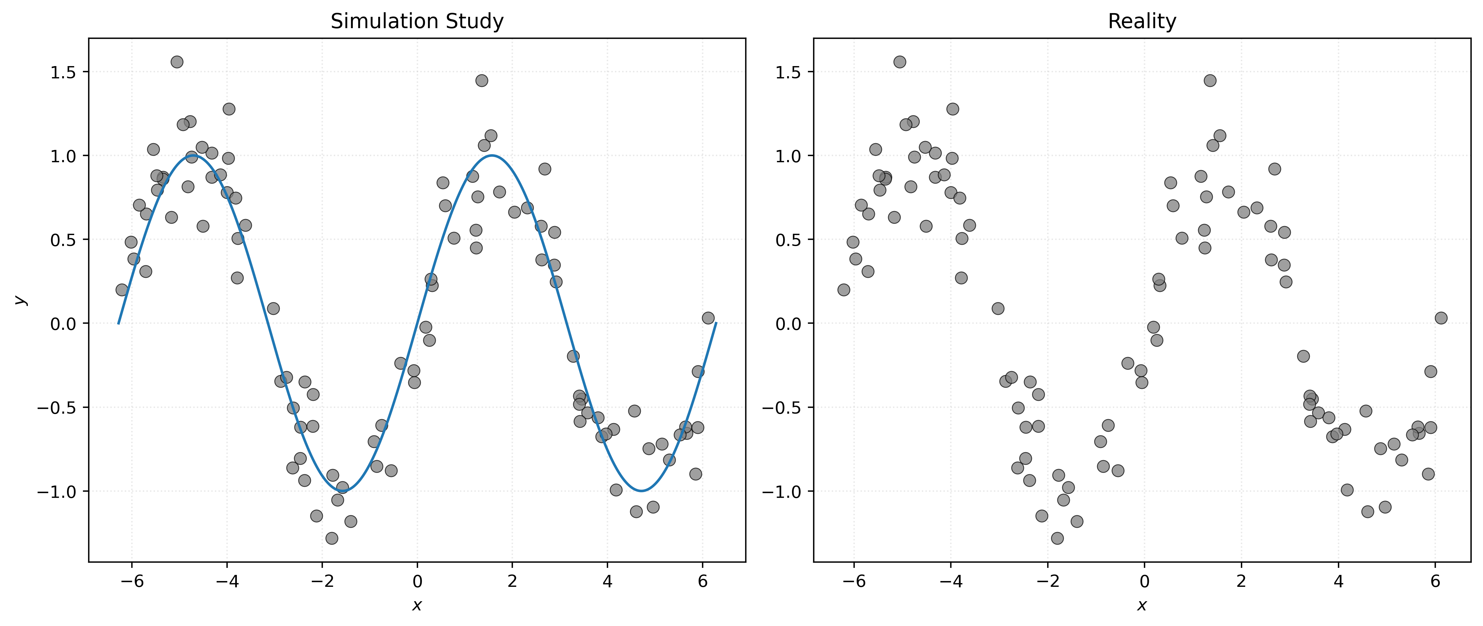
In some sense, the left panel of Figure 1 visualizes the data generating process. The sine wave is the signal, and the data generating process randomly places the points around the sine wave according to the distribution of the noise. The right panel shows the reality that we will face when dealing with the regression task. We only have access to the data, and instead need to infer how it was generated. So, another way of thinking about the regression task is inferring the left panel, specifically the unknown signal, from the right panel.
So, if \(f\) is a function that describes the true signal within the data generating process, our goal is to use the data to estimate \(f\) with \(\hat{f}\), a function that approximates \(f\) well enough to make good predictions of \(y\) given new \(X\) values.
Thinking about the right panel, without seeing the left…
- When \(x = -\pi\), what should we predict for \(y\)?
- When \(x = 0\), what should we predict for \(y\)?
- When \(x = \pi / 2\), what should we predict for \(y\)?
You can probably make some reasonable estimates, but how can we formalize this process? How can a machine learn to make these predictions? How can a machine learn to estimate \(f\)?
\(k\)-Nearest Neighbors
Before specifically introducing \(k\)-Nearest Neighbors (KNN), let’s discuss a simple but important general concept in machine learning, that you probably used when thinking about the predictions above.
Show Code for Plot
# setup figure
fig, ax = plt.subplots(figsize=(8, 5))

# plot all points, then re-color those in five nearest
ax.scatter(X, y, alpha=0.75, c="tab:gray")
ax.scatter(
    X[nearest_indices],
    y[nearest_indices],
    alpha=0.75,
    label="Nearest to $x=0$",
)

# add legend and axis labels
ax.legend()
ax.set_xlabel("$x$")
ax.set_ylabel("$y$")

# show figure
plt.show()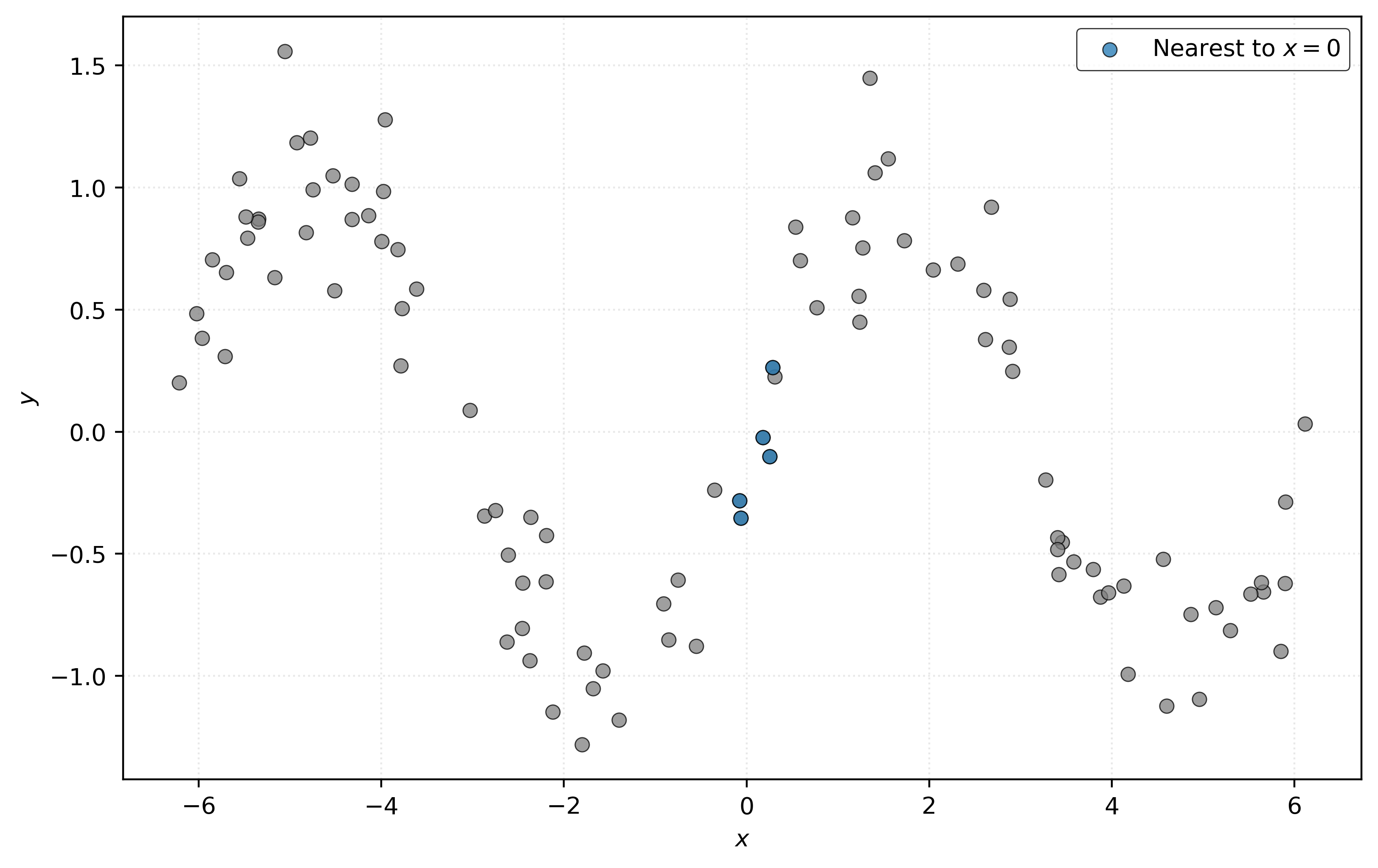
To predict \(y\) at \(x = 0\), find some “nearby” samples in the data, with respect to \(x\). To predict the value of \(y\) at \(x = 0\), average the \(y\) values of these samples.
In Figure 2, we’ve highlighted five points that are “nearby” to \(x = 0\). We then average their \(y\) values to predict \(y\) at \(x = 0\).
# get the "distance" of each point from x = 0
distances = np.abs(X).ravel()

# get the indexes for the five nearest neighbors
nearest_indices = np.argsort(distances)[:5]
# x values of the five nearest neighbors
print(X[nearest_indices])[[-0.0606]
[-0.078 ]
[ 0.1789]
[ 0.2522]
[ 0.2857]]# y values of the five nearest neighbors
print(y[nearest_indices])[-0.3527 -0.2818 -0.0226 -0.1009 0.2625]# average of the y values, use as prediction
print(np.mean(y[nearest_indices]))-0.09912979149490428Because we know the data generating process, we know that at \(x = 0\), \(y = \sin(0) = 0\), so our prediction here seems reasonably close. Of course in practice, we’ll need some other way to check our predictions.
Two questions arise:
- How is “nearby” defined? Distance, most often the Euclidean distance.
- How many “nearby” samples should we use? Good question!
If we formalize this process by picking a distance metric and a number of “nearby” samples, which we will call neighbors, we are describing \(k\)-nearest neighbors (KNN).
For some \(k\), which determines the number of neighbors to use, predict \(y\) at \(x\) using
\[ \hat{f}(x) = \frac{1}{k} \sum_{ \{i \ : \ x_i \in \mathcal{N}_k(x, \mathcal{D}) \} } y_i. \]
Here, we have:
- \(\mathcal{D} = \{ (x_i, y_i) \in \mathbb{R}^p \times \mathbb{R} \ \vert \ i = 1, 2, \ldots, n \}\), the data used to fit the model, where \(p\) is the number of features.
- \(\{i \ \vert \ x_i \in \mathcal{N}_k(x, \mathcal{D}) \}\), the indexes of the samples that contain a value that is among the \(k\) nearest neighbors to the point.
Don’t let this notation scare you! This is just a mathematical way of saying: find the \(k\) closest points to \(x\) and average their \(y\) values.
While it is simple enough to implement KNN in Python, we will instead use the KNeighborsRegressor class from sklearn.
Let’s use sklearn to fit a KNN model to the simulated data.
We start by initializing a KNN regressor object with \(k=5\) neighbors:
knn = KNeighborsRegressor(n_neighbors=5)This initialization creates a model object (named knn) with the specified parameters, but it hasn’t learned from any data yet. The model is just configured and ready to be fit.
Next, we fit the model using the .fit method by supplying the features X and response y.
_ = knn.fit(X, y)Now we can use the model we fit to predict with the .predict method. Here, we only need to supply the feature data, X, at which we want to make predictions.
knn.predict(X)array([-1.0798, -0.6912, 0.487 , 0.8163, 0.8792, 0.8792, 0.7342,
-0.8962, 0.8163, 0.5533, 0.4161, -0.4859, -0.7048, 0.6769,
0.9346, 0.9346, -0.6429, 0.2402, -0.6564, -0.6223, 0.9656,
0.9004, -0.6223, -1.0798, -0.6564, -0.4974, 0.6769, 0.0021,
0.8163, 0.7164, 0.853 , 0.9594, 0.8883, -0.6912, -0.6158,
-0.6128, -0.6429, 1.0781, 0.6454, -0.6564, 1.0482, -0.1994,
0.5066, -0.8083, -0.389 , 0.766 , -0.6649, 0.2402, 0.5066,
0.8119, -0.4859, -0.4974, -0.7299, -0.9001, 0.8163, -0.7823,
1.0206, 0.757 , 0.7164, -0.6944, -1.0798, -0.389 , -0.7048,
-1.0732, -0.389 , 0.5066, 0.9004, -0.6128, 0.8072, -0.4859,
-0.4301, 0.6769, 0.4161, -0.7048, 0.5821, 0.487 , -0.4301,
0.8072, -1.0732, 1.15 , -0.8962, 1.0324, -0.6944, 0.8883,
-0.6649, -0.6944, 0.487 , 1.0144, -0.8417, -0.4719, 1.0482,
0.5533, -0.4301, 0.6295, -0.4301, -0.1994, 0.2402, -0.8449,
0.4161, 1.15 ])To get a better sense of how good these predictions are, we visualize the data, together with the estimated signal \(\hat{f}(x)\), which is essentially the output of the .predict method for each possible value on the \(x\)-axis of the plot.
Show Code for Plot
# setup figure
fig, ax = plt.subplots(figsize=(8, 5))

# x values to make predictions at for plotting purposes
x_plot = np.linspace(-2 * np.pi, 2 * np.pi, 1000).reshape((-1, 1))

# create scatterplot of data and add estimated f
ax.scatter(X, y, alpha=0.75, c="tab:gray")
ax.plot(x_plot, knn.predict(x_plot), label="k = 5", zorder=1)

# add legend and axis labels
ax.legend()
ax.set_xlabel("$x$")
ax.set_ylabel("$y$")

# show figure
plt.show()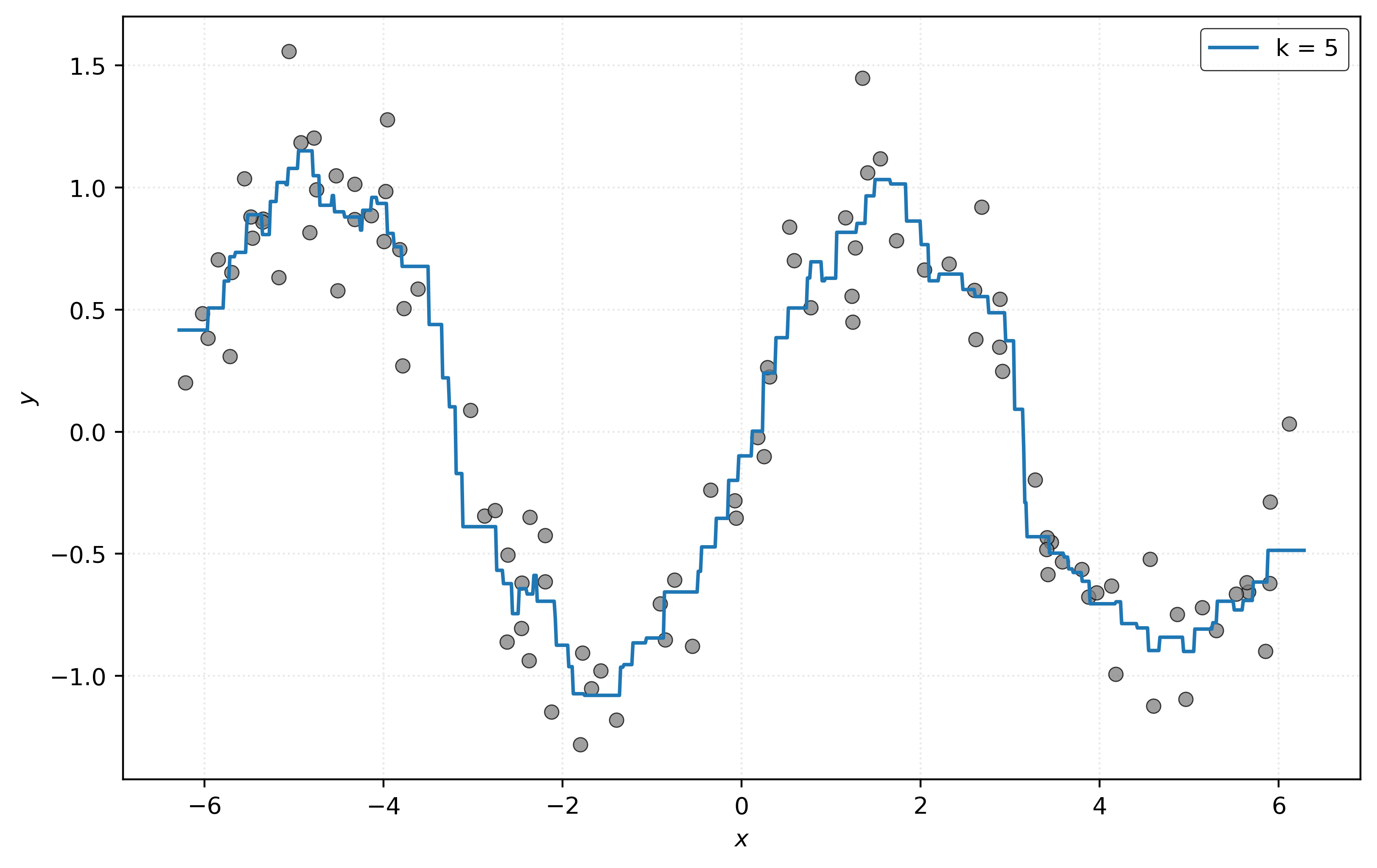
Distance Metrics
Given two vectors \(a\) and \(b\):
\[ \begin{aligned} a &= (a_{1},a_{2},\ldots ,a_{n}) \in \mathbb {R}^{n} \\ b &= (b_{1},b_{2},\ldots ,b_{n}) \in \mathbb {R}^{n} \end{aligned} \]
We define the Euclidean distance between \(a\) and \(b\) as
\[ d(a, b) = \left(\sum _{i=1}^{n}|a_{i}-b_{i}|^{2}\right)^{\frac{1}{2}} = \sqrt{\sum _{i=1}^{n}|a_{i}-b_{i}|^{2}}. \]
We define the Manhattan distance between \(a\) and \(b\) as
\[ d(a, b) = \sum _{i=1}^{n}|a_{i}-b_{i}|. \]
For example, with two points in three dimensions:
\[ \begin{aligned} a &= (a_1, a_2, a_3) = (1, 2, 3)\\ b &= (b_1, b_2, b_3) = (4, 5, 6) \end{aligned} \]
We calculate the Euclidean distance between \(a\) and \(b\) as:
\[ \begin{aligned} d(a, b) &= \sqrt{\sum _{i=1}^{3}|a_{i}-b_{i}|^{2}} \\ &= \sqrt{(1 - 4)^2 + (2 - 5)^2 + (3 - 6)^2} \\ &= \sqrt{9 + 9 + 9} \\ &= \sqrt{27} \\ &\approx 5.19615 \end{aligned} \]
Figure 4 shows the distance between \((1, 1)\) and \((4, 5)\). The solid gray line shows the Euclidean distance, while the dashed gray line shows the Manhattan distance. The Euclidean distance is the “shortest” path between two points, while the Manhattan distance is the sum of the horizontal and vertical distances. The Manhattan distance (also known as the taxicab distance) gets its name from the grid-like layout of Manhattan streets.
Show Code for Plot
# define two points
a = np.array([1, 1])
b = np.array([4, 5])

# calculate distances
euclidean_distance = np.sqrt(np.sum(np.abs(a - b) ** 2))
manhattan_distance = np.sum(np.abs(a - b))

# setup figure
fig, ax = plt.subplots(figsize=(8, 5))

# add points
ax.scatter(*a, label="Point $a$", s=50, alpha=0.75, zorder=3)
ax.scatter(*b, label="Point $b$", s=50, alpha=0.75, zorder=3)

# path for Euclidean distance
ax.plot(
    [a[0], b[0]],
    [a[1], b[1]],
    color="gray",
    label=f"Euclidean Distance: {euclidean_distance:.2f}",
)

# path for Manhattan distance
ax.plot(
    [a[0], a[0]],
    [a[1], b[1]],
    color="gray",
    linestyle="dashed",
)
ax.plot(
    [a[0], b[0]],
    [b[1], b[1]],
    color="gray",
    linestyle="dashed",
    label=f"Manhattan Distance: {manhattan_distance:.2f}",
)

# alternative path for Manhattan distance
ax.plot([1, 3], [1, 1], color="gray", linestyle="dotted")
ax.plot([3, 3], [1, 2], color="gray", linestyle="dotted")
ax.plot([3, 4], [2, 2], color="gray", linestyle="dotted")
ax.plot(
    [4, 4],
    [2, 5],
    color="gray",
    linestyle="dotted",
    label=f"Alternative Manhattan Path: {manhattan_distance:.2f}",
)

# add labels and legend
ax.set_xlabel("$x$")
ax.set_ylabel("$y$")
ax.set_xlim(0, 7.2)
ax.set_ylim(0, 5.5)
ax.legend(loc="lower right")
ax.set_aspect("equal")

# show figure
plt.show()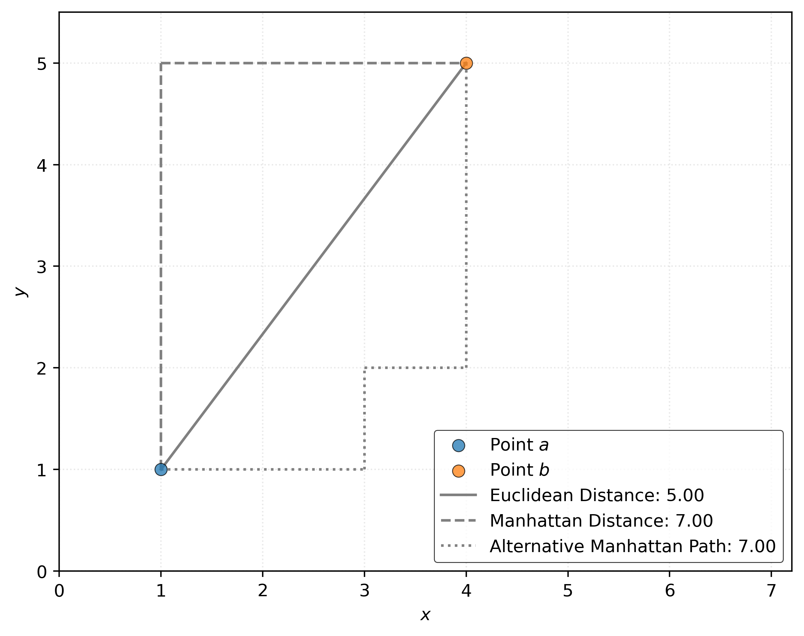
We also define the Minkowski distance between \(a\) and \(b\) as
\[ d(a, b) = \left(\sum _{i=1}^{n}|a_{i}-b_{i}|^{p}\right)^{\frac {1}{p}} \]
For each valid value of \(p\) (\(p \geq 1\)), the Minkowski distance specifies a particular distance. Note that when \(p=1\), this is the Manhattan distance. When \(p=2\) this is the Euclidean distance.
KNN Regression Parameters
The KNeighborsRegressor class has several important parameters in addition to n_neighbors (\(k\)) that control how the algorithm behaves.
Let’s examine the default parameter values:1
knn.get_params(){'algorithm': 'auto',
'leaf_size': 30,
'metric': 'minkowski',
'metric_params': None,
'n_jobs': None,
'n_neighbors': 5,
'p': 2,
'weights': 'uniform'}The key parameters we should understand are:
n_neighbors: The number of nearest neighbors, \(k\) to use for predictions.weights: How to weight the contributions of neighbors. The default'uniform'gives equal weight to all neighbors, while'distance'weights closer neighbors more heavily.metric: The distance metric to use. The default is'minkowski'. We will not modify this parameter. Instead use the next parameter,p, to modify the distance metric if needed.p: The power parameter for the Minkowski distance metric. Whenp=1, we get Manhattan distance. Whenp=2, we get Euclidean distance.
These parameters allow us to customize the KNN. For example, using distance-based weighting can help when we have neighbors at very different distances from our query point.
How do we know which values to use for each parameter? Good question, but we’ll need to delay the answer for now. Spoiler: it depends.
Regression Metrics
How do we quantify the performance of a model? Generally, we compare predicted values to actual values, but there are many ways to do so.
When calculating regression metrics:
- \(y\) is a vector of the true (actual) values of length \(n\)
- \(y_i\) is a particular element of this vector
- In
sklearn, this vector will be referenced asy_true.
- \(\hat{y}\) is a vector of the predicted values of length \(n\)
- \(\hat{y}_i\) is a particular element of this vector
- In
sklearn, this vector will be referenced asy_pred.
- \(n\) is the number of samples, which is the same for the actual and predicted values
- \(\bar{y} = \frac{1}{n} \sum_{i=1}^{n} y_i\)
Root Mean Squared Error
The root mean squared error (RMSE) is the square root of the average squared errors, as the name suggests.
\[ \text{RMSE}(y, \hat{y}) = \sqrt{\frac{1}{n} \sum_{i=1}^{n} (y_i - \hat{y}_i)^2} \]
Without the root, we would have mean squared error (MSE). Later we will see that both would select the same model, however we have a strong preference for RMSE because it has the same units as the \(y\) variable, whereas MSE will have the original units squared.
Because RMSE is measuring errors, a lower RMSE value is better.
Mean Absolute Error
The mean absolute error (MAE) is the average absolute error.
\[ \text{MAE}(y, \hat{y}) = \frac{1}{n} \sum_{i=1}^{n} |y_i - \hat{y}_i| \]
Compared to RMSE, it places less emphasis on “large” errors.
Because MAE is measuring errors, a lower MAE value is better.
Mean Absolute Percentage Error
The mean absolute percentage error (MAPE) averages the (absolute) errors, as percentages of the true values.
\[ \text{MAPE}(y, \hat{y}) = \frac{1}{n} \sum_{i=1}^{n} \left| \frac{y_i - \hat{y}_i}{y_i} \right| \]
MAPE is useful when the \(y\) variable spans several orders of magnitude.
Because MAPE is measuring errors, a lower MAPE value is better.
Coefficient of Determination
The coefficient of determination is better known as \(R^2\), and we use it to calculate the proportion of variance of \(y\) that the model “explains”.
\[ R^2(y, \hat{y}) = 1 - \frac{\sum_{i=1}^{n} (y_i - \hat{y}_i)^2}{\sum_{i=1}^{n} (y_i - \bar{y})^2} \]
Unlike the preceding metrics, a higher \(R^2\) value is better.
Maximum Error
As the name suggests, the maximum error is exactly that, the largest (absolute) error made by the model.
\[ \text{MaxError}(y, \hat{y}) = \max |y_i - \hat{y}_i| \]
While usually not a useful metric in isolation, the max error is a quantity that you should almost always consider in addition to a metric like RMSE. Knowing the average error is useful, but the max error will help inform you about the worst-case scenario.
Calculating Metrics
Let’s calculate the RMSE for the KNN model we fit above.
y_pred = knn.predict(X)
knn_rmse = np.sqrt(np.mean((y - y_pred) ** 2))
print(knn_rmse)0.21409223799766613While this calculation is easy enough, especially with vectorized NumPy operations, sklearn provides functions in the metrics submodule to calculate these metrics, and many more.
print(root_mean_squared_error(y, y_pred))0.21409223799766613Right now, this number is just that, a number. Because we are using simulated data, there is no context in which to consider this number.2 When we look at real data, we will always interpret values of metrics in the context of the data. The same RMSE will have two wildly different meanings depending on the situation.
Comparing Models
Let’s fit three different KNN models, each with a different value of \(k\).
knn_001 = KNeighborsRegressor(n_neighbors=1)
knn_010 = KNeighborsRegressor(n_neighbors=10)
knn_100 = KNeighborsRegressor(n_neighbors=100)
_ = knn_001.fit(X, y)
_ = knn_010.fit(X, y)
_ = knn_100.fit(X, y)Because the feature data is one-dimensional, we can plot the data, and overlay the estimated signal, \(\hat{f}(x)\), for each.
Show Code for Plot
# setup figure
fig, ax = plt.subplots(figsize=(8, 5))

# x values to make predictions at for plotting purposes
x_plot = np.linspace(-2 * np.pi, 2 * np.pi, 1000).reshape((-1, 1))

# add data and estimated f for each model
ax.scatter(X, y, c="tab:gray", alpha=0.75)
ax.plot(x_plot, knn_001.predict(x_plot), label="k = 1", linestyle="solid")
ax.plot(x_plot, knn_010.predict(x_plot), label="k = 10", linestyle="dashed")
ax.plot(x_plot, knn_100.predict(x_plot), label="k = 100", linestyle="dotted")

# add legend and axis labels
ax.legend()
ax.set_xlabel("$x$")
ax.set_ylabel("$y$")

# show figure
plt.show()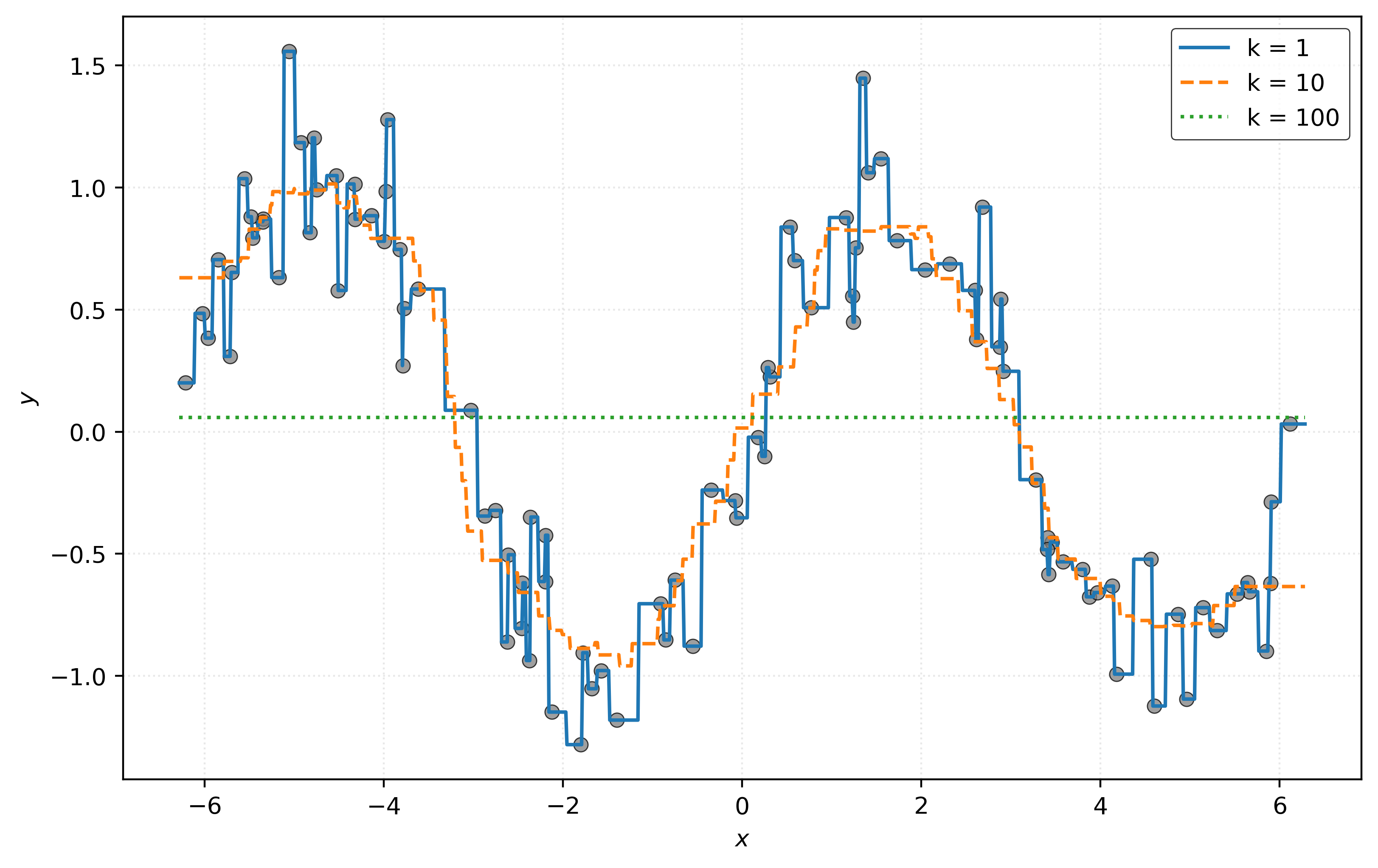
Looking at Figure 5, you probably have a strong preference for the model with \(k = 10\). However, you’re probably cheating a bit. That preference is likely based on knowing the true signal here! The orange dashed curve for \(k = 10\) most closely matches the hidden true signal.
In practice, we will of course not know the true signal! So instead of visually inspecting predictions (which will also not be possible in higher dimensions), we will use a metric to quantify the performance of a model. Let’s calculate the RMSE of each of these models.
rmse_001 = root_mean_squared_error(y, knn_001.predict(X))
rmse_010 = root_mean_squared_error(y, knn_010.predict(X))
rmse_100 = root_mean_squared_error(y, knn_100.predict(X))print(f"RMSE with k = 1: {rmse_001:.2f}")
print(f"RMSE with k = 10: {rmse_010:.2f}")
print(f"RMSE with k = 100: {rmse_100:.2f}")RMSE with k = 1: 0.00
RMSE with k = 10: 0.26
RMSE with k = 100: 0.75Except for \(R^2\), each of the metrics we have described for regression, including RMSE, are of the “lower-is-better” variety. So, based on RMSE, the model with \(k = 1\) is best, right? No! The goal of the regression task is to make good predictions for unseen data. Here, we are cheating. We’re evaluating the model on existing data, which we used to fit the models.
Instead, we need to evaluate the models using data that we did not use to fit the models. Because we have the ability to simulate data, we can do just that, simulate more data!
# simulate "new" data
X_new, y_new = simulate_sin_data(
    n=50,
    sd=0.25,
    seed=307,
)
We’ll first re-create the previous plot, with the same estimated signals, but the new data.
Show Code for Plot
# setup figure
fig, ax = plt.subplots(figsize=(8, 5))

# x values to make predictions at for plotting purposes
x_plot = np.linspace(-2 * np.pi, 2 * np.pi, 1000).reshape((-1, 1))

# add data and estimated f for each model
ax.scatter(X_new, y_new, c="tab:gray", alpha=0.75)
ax.plot(x_plot, knn_001.predict(x_plot), label="k = 1", linestyle="solid")
ax.plot(x_plot, knn_010.predict(x_plot), label="k = 10", linestyle="dashed")
ax.plot(x_plot, knn_100.predict(x_plot), label="k = 100", linestyle="dotted")

# add legend and axis labels
ax.legend()
ax.set_xlabel("$x$")
ax.set_ylabel("$y$")

# show figure
plt.show()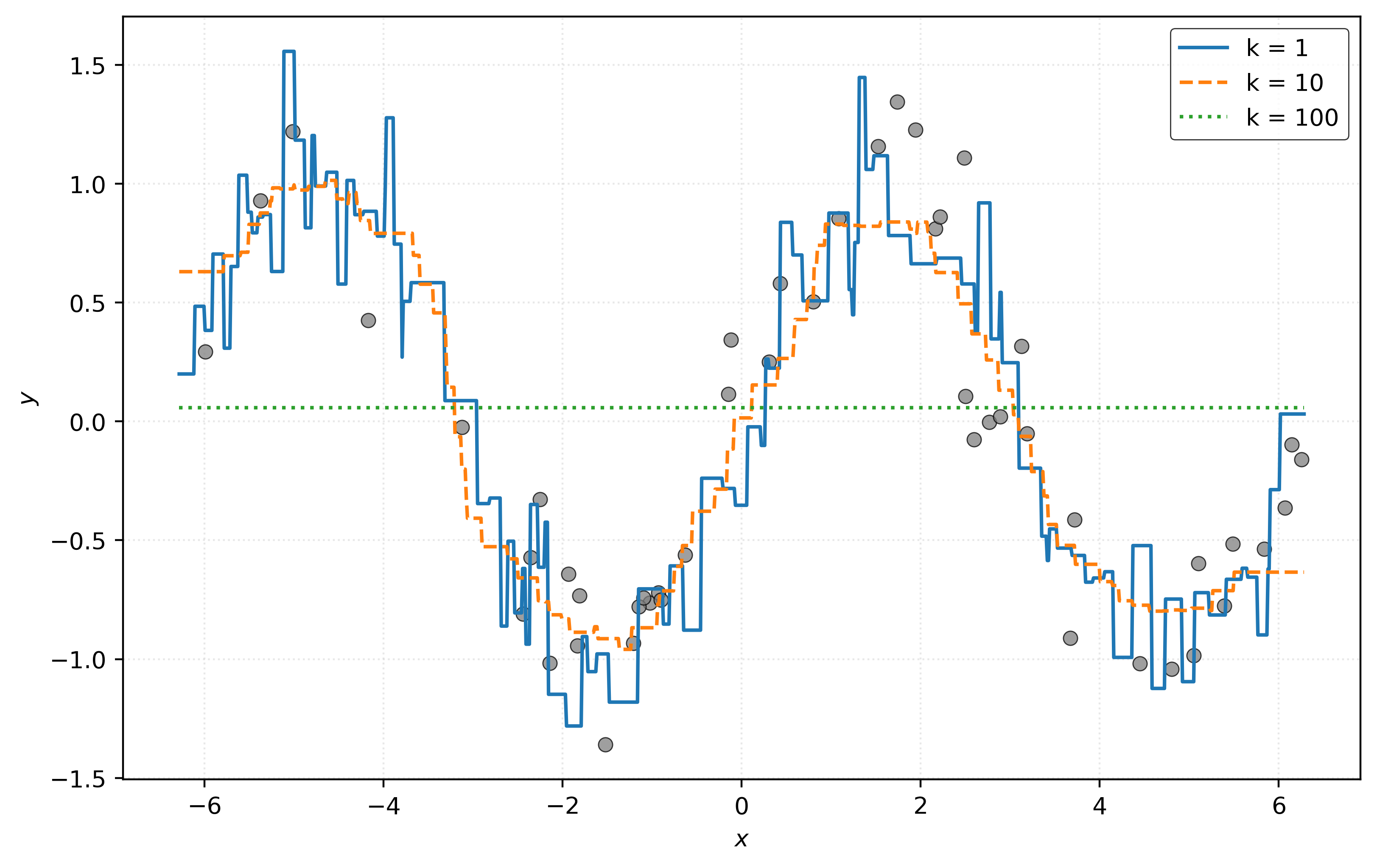
The most striking difference: KNN with \(k=1\) no longer passes through each data point! Let’s calculate RMSE again.
rmse_001 = root_mean_squared_error(y_new, knn_001.predict(X_new))
rmse_010 = root_mean_squared_error(y_new, knn_010.predict(X_new))
rmse_100 = root_mean_squared_error(y_new, knn_100.predict(X_new))print(f"RMSE with k = 1: {rmse_001:.2f}")
print(f"RMSE with k = 10: {rmse_010:.2f}")
print(f"RMSE with k = 100: {rmse_100:.2f}")RMSE with k = 1: 0.35
RMSE with k = 10: 0.28
RMSE with k = 100: 0.75Interesting! Now the model with \(k=10\) achieves the lowest RMSE, matching our (cheating) intuition.
Of course in practice, we will rarely if ever be able to simply acquire new data. Instead, in the next note, we’ll introduce strategies to mimic “creating” new data, using only available data.
Baseline Dummy Model
While KNN is one of the simplest and most foundational models, there is one model that is even simpler, which we will often use as a baseline for comparison.
sklearn calls this model the DummyRegressor.
Let’s fit this model and see if we can figure out what it does.
dummy = DummyRegressor()
_ = dummy.fit(X, y)
print(dummy.predict(X_new[:5]))
[0.0582 0.0582 0.0582 0.0582 0.0582]Here, we’ve fit the model to the original data, then made predictors for the first five observations in the new data. Notice anything interesting? It seems to always predict the same value! But what is this value?
print(np.mean(y))0.05816686771319791By default dummy regressor simply predicts the sample mean of the \(y\) data used to fit the model.3 It ignores the features, hence the “dummy” label.
Why is this useful? A dummy regressor helps by establishing a baseline model for comparison. If another method cannot outperform this baseline, it’s either a terrible model, or there isn’t much signal to be learned.
Regression Diagnostic Visualizations
The previous visualizations are incredibly informative, however, are only possible because we have a single feature variable. In practice, we need visualizations that do not rely on this fact, as most real-world data will have many features.
Histogram of Residuals
A histogram of residuals helps us understand the distribution of prediction errors. Residuals are the differences between actual and predicted values: \(r_i = y_i - \hat{y}_i\). Ideally, we want residuals to be roughly normally distributed around zero, indicating that our model’s errors are random rather than systematic.
residuals_010 = y_new - knn_010.predict(X_new)Show Code for Plot
fig, ax = plt.subplots(figsize=(10, 4))
ax.hist(residuals_010, bins=15, edgecolor="black", density=True)
ax.set_xlabel("Residuals")
ax.set_ylabel("Density")
plt.show()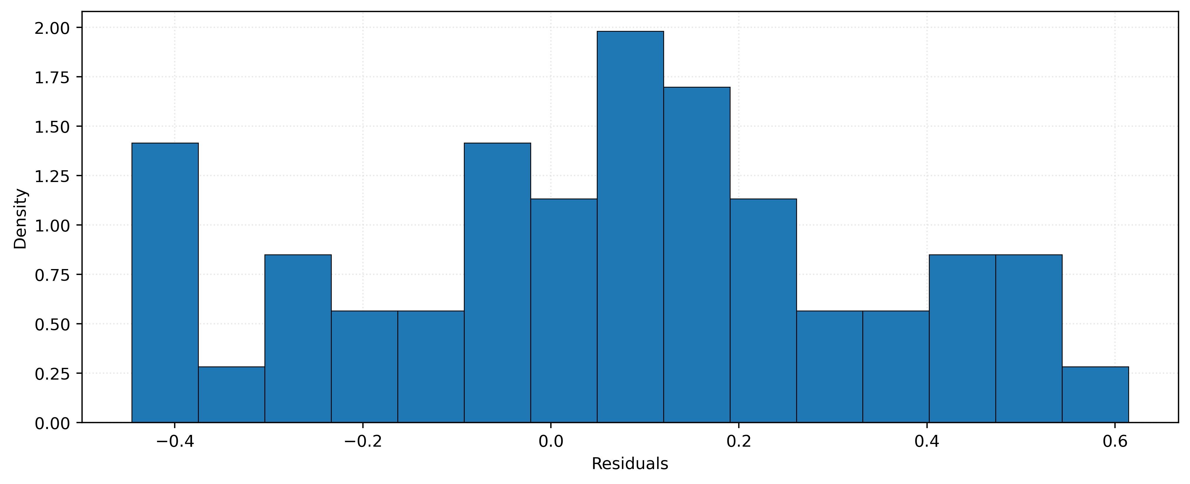
The histogram in Figure 7 shows the distribution of residuals for our KNN model with \(k=10\). The distribution appears roughly symmetric around zero, which suggests our model is not systematically over-estimating or under-estimating.
Predicted versus Actual Plot
A predicted versus actual plot helps us understand model performance by directly comparing predictions to true values. We plot actual values on the \(x\)-axis and predicted values on the \(y\)-axis. Perfect predictions would fall exactly on the diagonal line (indicating where predicted equals actual). Points closer to this line indicate better predictions, while points farther away indicate larger errors.
Show Code for Plot
# setup figure with two subplots side-by-side
fig, axes = plt.subplots(1, 2, figsize=(12, 5))

# plot for k=10
axes[0].scatter(y_new, knn_010.predict(X_new), alpha=0.50, zorder=1, c="tab:gray")
axes[0].axline((0, 0), slope=1)
axes[0].set_xlim(-1.5, 1.5)
axes[0].set_ylim(-1.5, 1.5)
axes[0].set_xlabel("Actual")
axes[0].set_ylabel("Predicted")
axes[0].set_title("$k = 10$")
axes[0].set_aspect("equal")


# plot for k=100
axes[1].scatter(y_new, knn_100.predict(X_new), alpha=0.50, zorder=1, c="tab:gray")
axes[1].axline((0, 0), slope=1)
axes[1].set_xlim(-1.5, 1.5)
axes[1].set_ylim(-1.5, 1.5)
axes[1].set_xlabel("Actual")
axes[1].set_ylabel("Predicted")
axes[1].set_title("$k = 100$")
axes[1].set_aspect("equal")

# show figure
plt.show()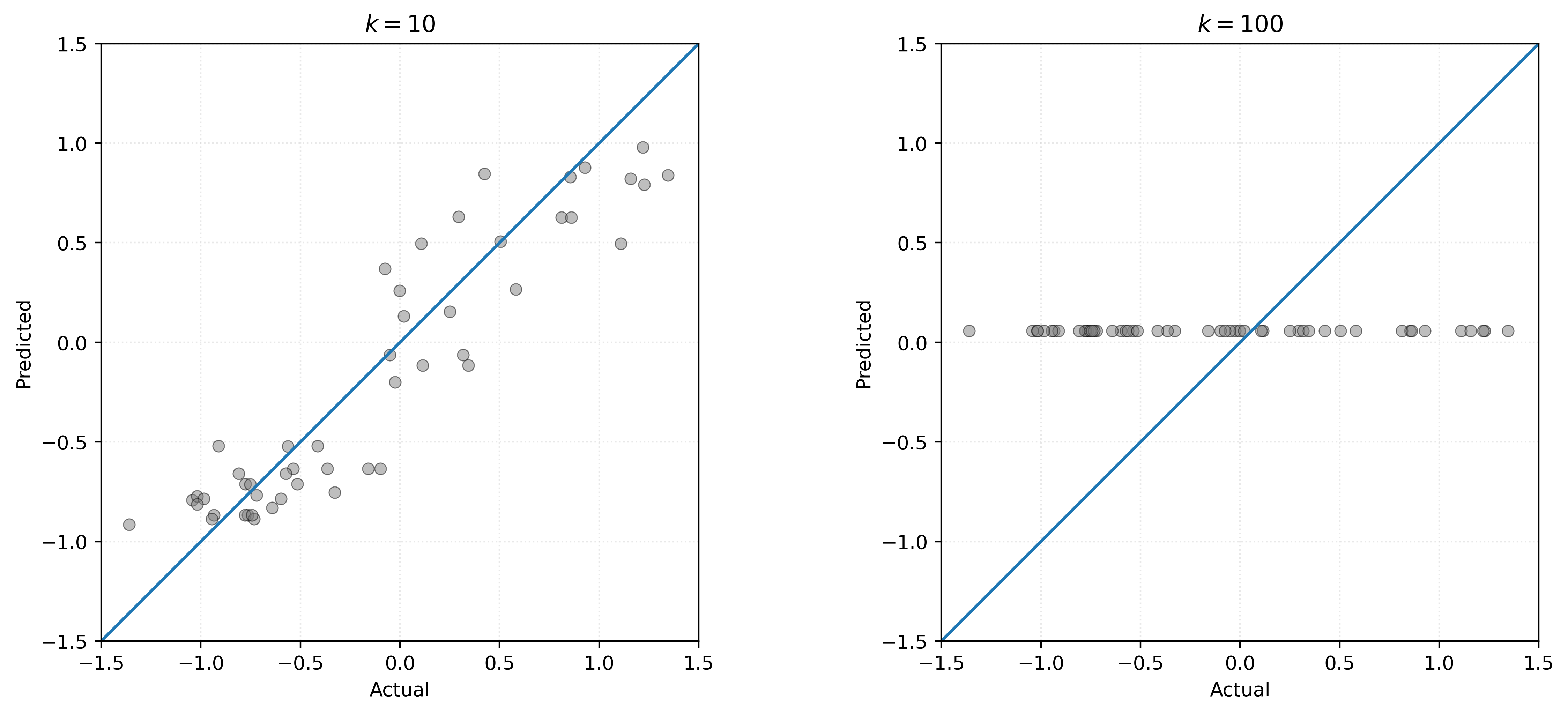
Comparing the two plots in Figure 8, we see that the \(k=10\) model produces predictions that concentrate more tightly around the diagonal line, indicating better performance. For \(k=100\), we have an extreme example of a bad model. It systematically under-predicts large true values, and over-predicts small true values. This is not at all surprising, given that the model only predicts a single value for any possible \(x\) value we use to make a prediction.
Residuals versus Predicted Plot
A residuals versus predicted plot helps us identify patterns in model errors. We plot predicted values on the \(x\)-axis and residuals on the \(y\)-axis. While the predicted versus actual plot shows overall model performance, the residuals plot makes it easier to spot systematic patterns in the errors. Ideally, we want to see residuals randomly scattered around zero with no clear patterns. If we observe systematic patterns (such as a curve or increasing spread), it suggests our model may be missing important relationships in the data.
Show Code for Plot
# setup figure
fig, ax = plt.subplots()

# x values to make predictions at for plotting purposes
x_plot = np.linspace(-2 * np.pi, 2 * np.pi, 1000).reshape((-1, 1))

# create scatterplot for KNN model
ax.scatter(knn_010.predict(X_new), residuals_010, alpha=0.50, zorder=1, c="tab:gray")
ax.axhline(0)
ax.set_xlabel("Predicted")
ax.set_ylabel("Residuals")
ax.set_aspect("equal")

# show figure
plt.show()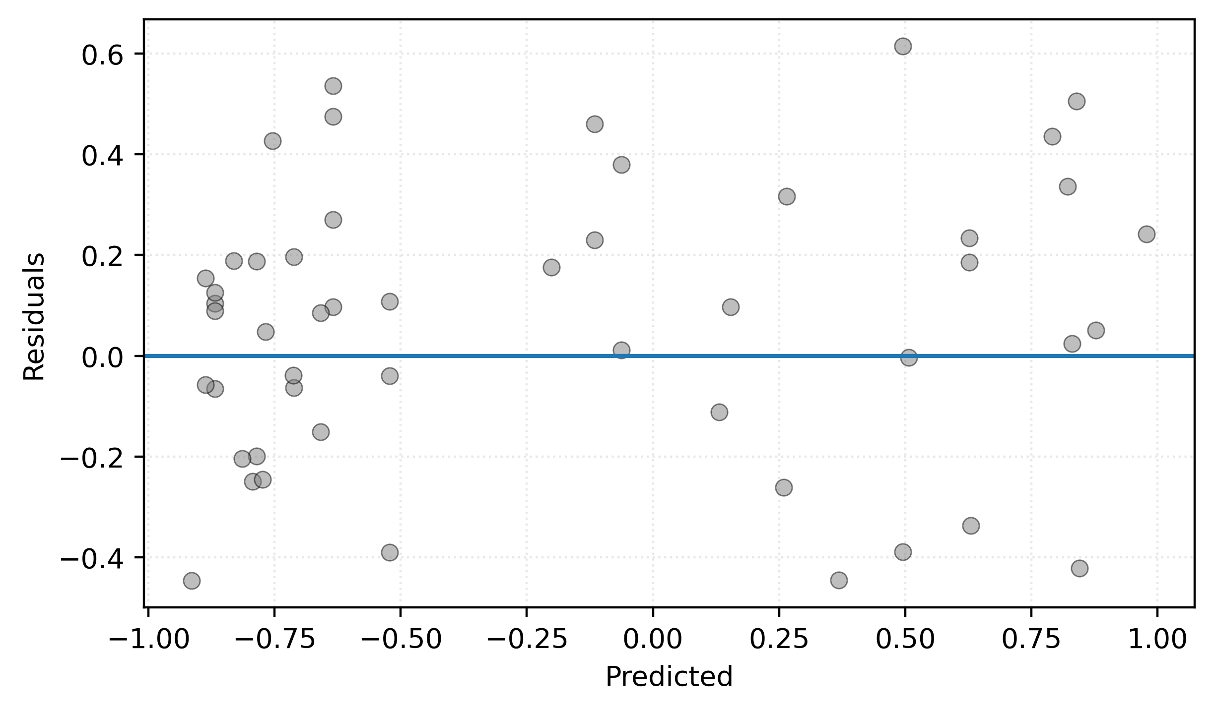
Figure 9 shows residuals scattered fairly randomly around zero, which is good. There’s no obvious pattern suggesting systematic bias at different prediction levels. The horizontal line at zero helps visualize whether residuals are centered appropriately.
Footnotes
We technically supplied
n_neighbors=5, but that is the default!↩︎Actually, we can compare against the known data generating process. Compare the standard deviation of the noise to our RMSE values. Notice anything?↩︎
By changing input parameters,
DummyRegressorcould predict other constant values like the median or some user-supplied constant.↩︎